No matter how advanced technology gets, I still find myself drawn to examples of physical branding I can touch. I understand the appeal of having everything stored in the cloud or on a smartphone, but when I go to a networking event or a client meeting, I expect to leave with business cards. Call me old fashioned, but I don’t really want to scan a QR code, bump our phones together, or try on your Google Glass to have your contact info conveniently burned into my retinas. I do, however, want a well-designed piece of branding I can keep. It shows me you care about your business enough to put thought into its appearance.
Most companies don’t need anything fancy. Simplicity never goes out of style, and a very basic, well-designed card beats a sloppy one any day. That being said, there are a lot of companies (especially in creative industries) who take things one step further with their unique business cards. These designs require imagination and a larger budget, but the end results are truly unique and leave a lasting impression. Here are a few of my favorite unusual business cards.
Give them something useful!

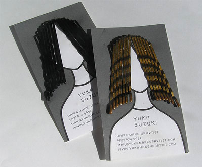
This is a really good way to ensure your card avoids the “straight to the garbage” treatment. At first glance, the cards for Yuka Suzuki are really interesting. She’s a hair stylist, so it makes sense to include a graphic of a person with hair, but the 3D element is what’s most exciting about this card.
If you happen to be a female with long hair like me- or if you just live with one- you know bobby pins are something we somehow manage to simultaneously have the most and the least of. Having someone give me a nice looking card I can actually use is a definite win in my book.

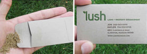
Similarly, the cards for Lush open up up to reveal a packet of seeds you can plant. This is perfect for a lawn care business because it not only gives them an opportunity to go into detail about their services, but it shows they have a passion for design, which is an integral part of landscaping.
Debossing is the new embossing.

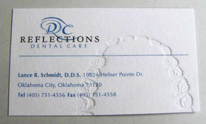
This is especially true if it happens to suit your business! We’ve all felt an embossed card before, and those raised letters are lovely, but these cards by Reflections Dental work really well because of the recessed teeth marks.
Most brands couldn’t get away with a card that was created to look like it was in someone’s mouth, but for a dentist, it’s a really interesting and unique design detail. I don’t necessarily love the way the information is laid out on the card, but thinking outside the box and adding some texture makes up for it in this case.
Use Folds.

I have rarely been handed a folded business card. I wouldn’t suggest designing one unless you have a good reason. Andrew Murray Roofing has cards that leave you with no question as to what the company does. The fold creates a palm-sized roof peak and has a crisp, close-up photo of shingles on the front. I especially appreciate how simply the designer laid out the contact info on the inside. It doesn’t compete with the card’s interesting design.
Show them exactly what you do.

These cards are some of my favorites because they’re from creative individuals and they leave you with a piece of art. The cards by Lars Swanson are actually his contact information printed on 35 mm film slides. This is such an awesome way to get recognition for your work because anyone you give it to then owns a bit of original photography.

The London-based furniture company Bentply designed their cards to be really interactive. While they start out flat, when folded correctly you can create your own modern chair. This shows a certain level of skill and artistic vision, making these cards some of the most impressive I’ve seen.
So what do you think? Is your business ready to try out something fun and different with your branding this year?
