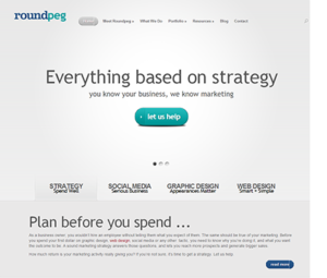
Pictures are a vital part of the marketing equation. We have written countless blog posts about the importance of great images to improve the chances your content will be noticed. We design websites with expansive photo spreads, manage Pinterest accounts for clients, and I am an active amateur photographer. With all this emphasis on photos, you would expect our home page would include at least a few pictures of our team and examples of our work.
 But that’s not what you see. Not in the new website launching this week, or the versions which have preceded it. Why? It’s hard to capture what we do in a photograph.
In our last three sites, we opted for text only, with just a few phrases to capture the essence of who we are and what we do. That was fine in the earlier versions, but with current design trends, what looked sleek and clean two years ago looks drab today.
As we approached this redesign we kicked around ways to add meaningful images to the homepage, without clutter. Although we wanted more calls to action, we still wanted to retain a clean approachable feel. We knew that whatever look we established would have to work beyond our website, on Facebook, LinkedIn, Google+ and in printed material, too. That’s a huge burden to place on a few images.
We considered screen grabs of websites and examples of logos but those elements are like the tip of an iceberg. And by focusing on just the elements we could photograph, we only told a part of the story. We wanted images which gave people the full picture of the experience of working with Roundpeg.
 We know that what sets us apart is our strategic approach to marketing. Those valuable and interactive working sessions can’t be boiled down to a photo. Some companies which do this same type of work end up with a cheesy stock photograph of people sitting at a table in their rotating banner.
We don’t want to use the cheesy images and we don’t really want to put pictures of us on the home page. We aren’t shy, we just think the homepage shouldn’t be about us, but about what we do for clients, which begins by really listening to them.
All of which brings us back to the same question. What should we put on the rotating banner on our homepage? When you see the simple-looking graphics we chose, it may be hard to believe how much time was spent talking about them. Was it worth it? Absolutely, because the conversations that led us to these graphic were about more than the design–they were about what we wanted people to think and feel about Roundpeg. I really like what we have come up with.
The lesson from this process? If you are getting ready to redesign your website, take time to really think about your brand, the words and the pictures. If you want photography, spend a few dollars and get good photography. Choose something original which really represents you. If you need help, give us a call we would love to chat.
