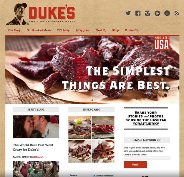
The Internet’s latest trend is BIG. Huge and high-def images, large-print text and wide-open spaces are all in the latest designs. What does this trend toward largeness mean for new small business websites? One of the most dramatic ways to jump on the big bandwagon is with a full-width homepage image slider right below the navigation bar. Below is a recent example from Roundpeg’s web design portfolio.
Duke’s Meats uses the space like a giant ad for their latest products. However, an eye-catching billboard on your homepage is just one way to fill the space. Here are four simple web design ideas to make the most of today’s über-big images.
Introduce Yourself
Use the space to welcome visitors and immediately establish the website’s tone. Write a short paragraph or several short phrases that convey your business’ mission. Use an image of the product or service. Avoid auto-play videos or smiling stock photo spokespeople.
There’s one catch with this design idea: intros aren’t the most effective use of such a large and valuable space. Between your logo and other calls to action on the homepage, it should be obvious what you do. But it doesn’t hurt to have a basic intro slide in the mix. Filler material like this is good to have for off-season or gap times when there aren’t announcements or promotions to display.
Show the News
Your business is exciting! Share the excitement with your web visitors on your homepage. Use the large image slider for new product announcements and the latest promotions. Keep the headline short and punchy, followed by an active call-to-action (buy, learn, start, do).
Remember, your most important information should appear on the first image. Feel free to include multiple images in the slider, but understand that most visitors will only see slide #1. They’ll most likely make their next click before the second slide rolls around. And be sure to keep your homepage current. With the large size of the image, this slider area is your homepage in a way. Stale news, stale homepage, stale you.
Offer a Coupon
If you sell online, the homepage is the perfect spot for a good coupon. Make the offer clear and the Buy Now button obvious. After clicking, website visitors should go immediately to a shopping cart page or a page to redeem the offer. Or link the slider to a printable coupon they can bring with them.
However, online coupons are where some websites dive straight into the cheesy deep end. I won’t name names, but some homepages I’ve seen resemble collages of newspaper clippings. Recycling graphics used for your print advertisements may seem cost efficient, but your website is a different medium. Shorten the copy and simplify the graphics and layout. If you offer a coupon, make it simple to understand and redeem.
Entice Visitors to Click Here
You can always serve up some eye candy with simple calls to action and beautiful visuals. Do you sell a product or service that looks good? Show it off on the homepage. Product shots and pictures of real people using your stuff make great images to pair with simple calls to action. Try words like Browse, Buy and Learn. If you’re a service provider, choose an image that shows off your work. Landscapers, show a beautiful yard enhanced by yours services. Kitchen re-modelers, show me cabinets and hardware to drool over. Plumbers, show me a happy family enjoying their well-maintained home.
The key to eye-candy is professionalism. Trust a pro photographer’s skills to light and set a scene that will look good in high definition, splashed on your homepage. Avoid close-ups and try to get a scene with lots of depth. You may even want to plan for some copy space, or an area of the photograph that text can be placed over and still be legible.
What web designs have caught your eye lately? Share your favorite sites in the comments below.

