If you’re starting a new website built on WordPress, you know there’s a ton of choices to make. Indeed, there’s a veritable vortex of settings and widgets to configure. But the most important choice you’ll make early on concerns your theme. This is the skin covering those settings and widgets and displaying your content. It’s the foundation of your WordPress web design, so it’s important to choose a theme that matches your marketing needs and design preferences.
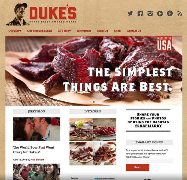
There are two basic layouts to pick from: full-width “featured” image areas or partial-widths. Your other web design choices will flow from the layout choose. We’ll explore the possibilities of both, starting with this gorgeous full-width example.
The full-width featured area puts the spotlight on gorgeous images of your product or services. The example above shows how a packaged foods company pairs images with short, punchy sales copy. Rich featured images draw your eyes down the page where there’s more delicious content to dig into. This big-picture style looks great on today’s widescreen monitors and the high-def photography certainly appeals to my stomach.
Choose full-width if:
- You’re looking for clean, simple Apple-like web design.
- You want plenty of room to focus on product images or work samples.
- Your audience needs big, descriptive visuals to help them make a decision.
The trick to getting it right
To take advantage of the full-width real estate, you need professionally taken photographs. Whether you hire a photographer or invest in quality stock photos, the images must be crisp and professionally lit. Your Web visitors have no choice but to scrutinize the images when you present them at such a large size. Don’t trust your own photography skills for this. Unless you’re a pro, you’ll only take an amateur image.
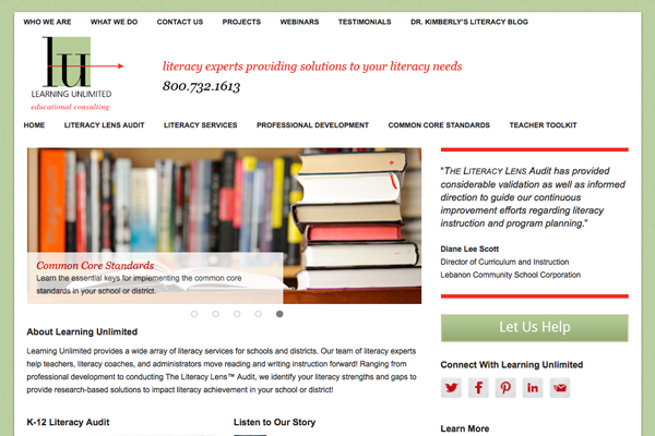
Thinking the full-width style is too much? Need room for calls-to-action? We can slice up the page to give you more options. The layout below uses part of the page for a featured image along with a sidebar for buttons and other nuggets of information.
We used to worry more about something called the fold. While the rules have changed, it’s still worthwhile to consider placing important information and CTAs near the top of your webpages. The full width image layout gives everything over to that big image. However, we can use the magic number three to break the layout into thirds. Typical layouts like this use two-thirds of the page for a featured image and the other third for CTAs.
Choose partial-width if:
- You’re looking for an information-rich homepage with lots of real estate for buttons and text.
- You want to prioritize CTAs.
- Your audience knows what they want and need quick access to certain pages.
What’s the trick?
With a more flexible space, you’ll need to plan more items to fill in that real estate. In addition, your CTAs need to be well written (active verbs!) and link to valuable content. There’s also a danger of overcrowding and creating a busy homepage. Avoid that by strictly prioritizing your homepage items with a visual hierarchy. Basically, that means designing the art and copy so it’s clear what’s most important.
One note about images: A smaller featured image size means you might be able to get away with taking your own pictures, but they’ll still need to be crisp and colorful. It’s always a good idea to get in touch with a professional photographer if you need help getting the right shots.
Building a website with WordPress is a great DIY project, but there’s a thousand options, settings, themes, plugins and other choices to make. There’s a reason home improvement stores are supposed to have helpful staff and there’s a reason we sometimes hire a contractor when we could paint the walls ourselves. Roundpeg works exclusively with WordPress, so we’re focused on helping you navigate the options and set-up a website you can maintain.
Have questions about which theme to pick or how to get started with a new website? We’d love to talk, just call or send us a message.


