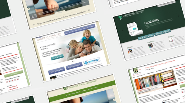
Notice anything different? You’re looking at a new website. No, really. Roundpeg.biz was totally redesigned in 2011 and simply refreshed over a few days last week. We added some exciting new features, brought some web design quirks back on-brand and fixed a number of bugs.
As the website guy, I’d been itching to address those issues and bring our own website up to speed with some of the new ideas we’ve developed since last year. Most of the changes were quick fixes and new configurations which took just a moment of time on their own. But this year has been really good and really busy, and we just haven’t had time to address that long wish-list of little changes. When we finally put a line item on the project list, it was late October, proving that nothing gets done if you don’t prioritize your own marketing and periodically treat yo’self like you should.
The biggest improvement we’re excited about is a re-formatted set of portfolios. These new layouts address the increasing expectation that images will be large and easy to browse. Logo samples are presented smaller than before, but visitors get a better idea of our range of work with more displayed on one page. Roundpeg’s print samples have new titles and captions to help tell their story. The web samples page underwent the most dramatic change. Extra-large screenshots of the project’s homepage give visitors more detail at a glance. Of course, each of our samples is attached to an explanatory blog post with details about its special features and the ideas that inspired them.
We love using screenshots with the blog like this. Smashing Magazine’s talking about “Retiring The Portfolio Screenshot“, but it makes a lot of sense for us. Visitors want the quick preview of a screenshot. What I like about Smashing’s article is the idea that more and more visitors are ready to read about the nitty-gritty of your business. While I won’t be posting code samples any time soon, I think our blog-style portfolio pages go the extra mile to help visitors understand the process as well as enjoy the product.
These new features and changes add up to a brand new website that’s actually just the same. It’s simplt easier for visitors and more flexible for us. The thing that kills me is that we could have been enjoying these features sooner. The lesson here is this: If your website has known issues or you’ve got a wish-list, don’t let it niggle at you from the back of your mind. Put time on your schedule and take care of it. After all, how can you take care of your customers if you aren’t taking care of yourself?
Got questions about your website? Wondering how to make upgrades and changes without overhauling everything? Get in touch, we’d love to help out.

