Dealing with a lot of information in a limited amount of space is a graphic design challenge I am faced with on a regular basis. I tend to be drawn to minimal designs and love to keep things simple, but with some projects, it can be hard to keep that minimalism when the client needs to convey a lot of information in a small space.
I’ve come up with several tactics I use to tackle really text heavy pieces: grouping, simplifying, creating meaningful icons and standardizing . Typically, selecting one, but some times combining all of these options, will result in a good design which communicates everything the client wants to say without overwhelming the reader.
I really needed to pull out this list for a collection of flyers I created for Allegient, and Indianapolis-based IT consulting firm. To date we have designed five pieces for them, all with varying amounts of text and information. The challenge was to fit everything they needed to say on one sheet (front and back) and keep a cohesive look to the series.
Take a closer look to see how we used these tactics to mange text heavy pieces for the Allegient project:
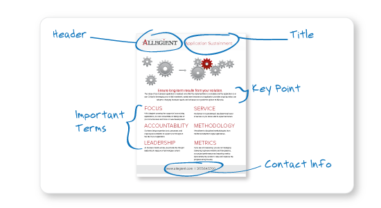
Grouping: Organizing information in a way that will make the most sense for the reader is really important, especially when there is a lot of content. For Allegient, this was mostly just a matter of creating sections of information, such as the header, title, key points, important terms, contact info, etc.
Simplifying: This often requires the cooperation of the client. I always try to read over the content and see what, if anything, can be removed or revised. If I think something is redundant or unnecessary, I will talk with the client, suggesting ways to trim some of the excess information. From time to time, I may lean on Allison’s writing skills to suggest a more concise way to make the same point.
Icons/Graphics: While it may seem like adding something to an already busy design would be counterproductive, this is often the best way to add a bit of visual interest and organize information around a common element. With Allegient we were able to illustrate the message by using simple graphics which matched the look of the brand. We also included some recognizable icons throughout to help the reader find areas of importance.
Standardizing: This is just a matter of deciding on a style for each piece of information and carrying it throughout the rest of the project. All the headers and footers are the same on all the pieces to make it clear they were meant to be a collection. Keeping the number of typfaces and colors to a minimum also helps the page feel less chaotic.
In the end, the set felt cohesive as a group, and most importantly, each page was easy to navigate and understand. Using a few simple techniques helped make it possible to fit a lot of information into a small space, without compromising the design.

