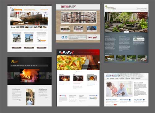
Ten years ago, web design was an exciting adventure. Every site was different as developers experimented with tools, images and formats. Visitors to those early websites were adventurers as well. Arriving at a site, they would slowly (especially if they had dial up) explore the site looking for information, unsure of what they would find. Delighted and entertained by flash animation, they would watch in fascination, waiting patiently for the opportunity to continue their exploration.
Today, we are not as patient. We view websites using high speed connections and often on the go with mobile devices. We want to find information quickly and move on. As a result, we want key information to be in essentially the same place on every site we visit.
This has forced web designers down a relatively narrow path. Elements like navigation once found on the top, bottom and side are now primarily at the top of the page. Is this the best place for navigation? It doesn’t really matter, because this is where customers expect to find it.
What else do all visitors want? Clear calls to action, logical navigation and above all, quick access to contact information. Does this mean that all websites look alike? Not at all! Check out the examples of some of our most recent web designs below.
While each one features a strong dominant image, which is a popular style element currently, each site has its own unique feel and still meets customer expectations. Being user friendly does not mean boring, or looking like everyone else. Finding the balance is the key to good web design.
All of the designs featured on this page were created using WordPress, by Roundpeg, an Indianapolis web design firm. You can see our entire web portfolio here.

