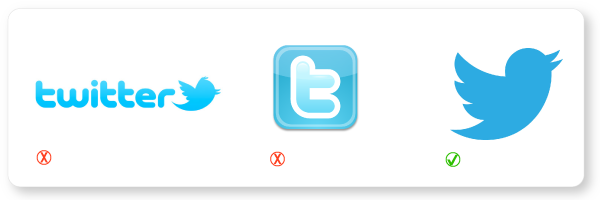
Earlier this week, Twitter unveiled their new logo. A simple, sleek bluebird which some may have a hard time even distinguishing from the old bird because the differences are fairly subtle. While the bird has been modernized and given a fresh new hair cut, the real change is the fact that word “Twitter” has been dropped from the logo.
Following in the footsteps of Apple, Nike, Starbucks and Target, Twitter has made the daring decision to be represented by a symbol alone. This confidence in their brand being universally recognized by the bird is somewhat shocking, especially since unlike Apple and Nike who took decades to make the switch, Twitter has only been around for six years.
As a huge fan of Twitter I am intrigued, albeit somewhat skeptical of this decision. While I admire the confidence required for such a bold move, I don’t necessarily believe Twitter has the same amount of brand recognition as more established companies. When Starbucks and Target switched over to the icon only, their logos were already recognizable to the majority of people, even without the company names.
You would most likely have a hard time finding a person who didn’t instantly recognize the red bullseye as Target, but Twitter’s bird is a long way from having such high recognition. While the name and the network might be everywhere, how many people automatically identify the bird with Twitter like they identify the mermaid with Starbucks? It’s a daring move, especially since Twitter is still actively recruiting new users, unlike Facebook, which has achieved market saturation and is looking to grow profits, not new users.
Not all of the changes to the logo were quite as drastic as the name drop. I’m sure many of you have begun noticing the changes to Larry the bird. Not only did he get a much needed haircut, but he also gained a more refined set of feathers, and an optimistic new posture. These changes, while subtle, really give the bird an updated and modern look.
Here is what Twitter had to say about it on their blog post on Tuesday:
“Our new bird grows out of love for ornithology, design within creative constraints, and simple geometry. This bird is crafted purely from three sets of overlapping circles … similar to how your networks, interests and ideas connect and intersect with peers and friends.” ―Twitter Blog Post
While I think the decision to drop the name may have been a bit risky, I really enjoy the aesthetic changes to the bird. The simplicity of the new logo tells me Larry the bird is ready to be an icon, I just hope people are ready to accept him as one.

