For those of you who have been keeping up with the Roundpeg blog for a while, you may remember when Sharayah wrote about designing her first WordPress theme for the Holeman Landscape website. She took on the task of creating a more functional site by steering them away from Flash. She also helped them simplify and modernize their overall appearance by adding some sleek new features and images.
They liked the new site as much as we did, which led them to call us when it was time to update some of their other marketing materials. With the home show season starting and farmer’s markets just around the corner, it’s great that Holeman Landscape decided to take the time to make sure they were presenting a coherent brand identity across all of their materials.
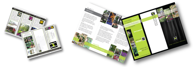
The trifold brochure they were using had an outdated look. Its confusing layout made it difficult for customers to easily determine the key benefits of working with Holeman.
In my opinion, the most problematic area of the brochure was the front cover. The cover was laid out horizontally, while the inside was vertical, making it hard to read between all the various pages. Additionally, the over-sized logo was overwhelming and there was too much information on the slim cover. When I design brochures I try to keep the cover as simple as possible. The job of the front cover is to convince people there is valuable information inside, and with a landscaping company, that is best proven through photographs.
The new front cover has a vertical layout, which matches the inside. I kept the text to a minimum and placed a smaller, more tasteful logo near the bottom. I wanted the focus to be on the three photos at the top which showcase the amazing work Holeman Landscape does. The background is a black and white image of tree trunks which is also on their website.
For the inside, Peter spruced up the copy and gave me a really nice title for each of the three sections. I wanted to keep the entire piece unified, so I decided to carry over the photo layout and color bar from the cover. Even though the photos are smaller than the old brochure, the way they are laid out gives them a sense of movement, which in turn makes them stand out more. The new layout also gives the text more space which allows for better spacing and increased readability.
On the other two panels, I placed the contact information, the company tagline and a QR code that can be scanned to view their work. The new placement allows this information to be prominent, yet not overwhelming. I left the back panel very simple since it will most likely be used as a mailer.
The new brochure looks very sleek, modern and most importantly, on brand. It focuses a lot on the impressive work done by Holeman Landscape, and will make a great addition to the rest of their eye-catching marketing materials.

