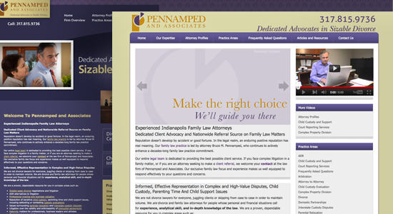
Sometimes you can have too much of a good thing. When we started working with Pennamped & Associates, we were asked to keep it simple. Their previous website was created from a cookie-cutter template. And it was drenched in royal purple to boot.
I get it, purple is great. It’s like blue, but less pedestrian. However, it can easily overpower every other color in a layout. We decided to reign in the purple for the new site, opting for a more pleasing balance that maintained the firm’s existing brand, but cleaned up and simplified the look of their website.
For Pennamped & Associates, the most important thing was to organize and update the information and resources offered by the site. No need for a glossy candy coating. We created a new site map and designed a fresh home page which used much of the same copy of the old site, but presented it in a way that enhanced readability and encouraged visitors to spend time on the site.
Bottom-line:
Even if purple is your favorite color, use it sparingly.
If you need your website visitors to absorb lots of information, spend the time to organize it for them.
Don’t be afraid to get your hands dirty. If your website is outdated or looking rough around the edges, take action to clean it up.

