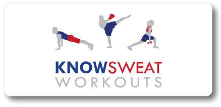
As a designer, one of my favorite things is when a design ends up surprising me. From the kick-off meeting to the end result, not every project ends up being what we initially envisioned. Fortunately, with KnowSweat Workouts this ended up being a positive thing. The challenge was finding a logo that would be able to represent the gym as a whole, but also include all the different fitness areas KnowSweat specializes in–like taerobics, personal training and weight loss services.
The first round of logos I came up with all involved the name placed next to or underneath one single graphic, either an active silhouette, or a more abstract shape to represent movement. While Marcia and I both thought these options looked nice, we agreed they weren’t capturing the full spectrum of programs offered by KnowSweat. There was one style of logo that involved a very simple kickboxing figure which appealed to Marcia because it was very clean and modern, so we started brainstorming ways to expand it to encompass their whole brand.
I decided to try a series of three figures, all done in the same style I used to create the kick boxer. Once the figures were placed together above the logo, I could instantly tell this was going to be the perfect look for KnowSweat Workouts. It suddenly seemed very energetic, and also conveyed the idea that this isn’t just a place you go to run on the treadmill for a bit, but where you are able to choose from many different programs designed to help you achieve the best results.
Although we initially planned to just do one basic logo that would be used everywhere, Marcia now has the option to use either the main logo with the three people, or use the various icons throughout her website to help people recognize the different types of programs. I’m really happy with the way this turned out because not only does it look sharp, it also has the versatility to be used in so many ways and still feel like a completely cohesive identity.

