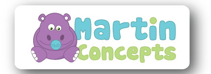
There is a first time for everything at Roundpeg, even cute jungle animals. At Roundpeg, we often design logos for very professional clients, such as law offices, manufacturing companies and other more traditional marks. Designing a logo for a company which sells children’s products was really different, but it wound up being a lot of fun.
When Ed Martin of Martin Concepts first approached us about designing his logo he had a pretty clear idea of what he wanted. Martin Concepts manufactures a products for babies, so I wanted to make sure this logo was youthful and fun. He was set on having an animal of some sort, and even came prepared with some clipart he had purchased in hopes we could use it. I was able to create a cleaner, more personalized version of the clipart he provided, which happened to be a hippo.
Oddly enough, this was not my first time incorporating a hippo into a logo, so I sort of knew what to expect. The challenge for me was keeping the hippo simple, but giving it enough detail to make it clear it was representing a product for babies. This was achieved using lighter colors and and also adding a pacifier. Once the hippo graphic was complete the font was an easy decision. I chose the font Cookies, not just for its awesome name, but because the round letters reminded me of the shapes in the hippos body. The final version ended up being a good balance of fun and simple, and I think it will be an interesting addition to our logo collection.
This is just one example of logos designed by Roundpeg, an Indianapolis Graphic Design Firm

