Creative. Innovative. Organized.
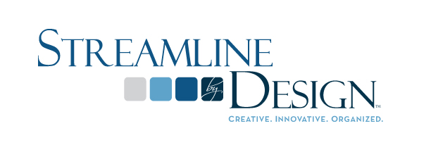
Those can be three tough words to illustrate in one logo. That was the challenge we took on in the design of a new logo for Streamline by Design.
Streamline by Design is a professional organizing company. When Leslie, the owner, came to us, she just had a text treatment. We fleshed it out to create a true logo which she can use to build her brand across brochures, web, and all of her other collateral.
Although Leslie came to us with a specific vision (she liked shades of blue and boxes), she was also incredibly open to our ideas. We went back and forth with tweaks until we wound up with a logo she loved because it conveys the order that she brings to clients’ lives, but also a sophisticated and fun feeling.
The logo is really orderly, which is one of the main things that Leslie wanted to do. The palette of blues is cool, but also give off a modern, professional air. The pattern of four squares in the logo also creates the idea of a “streamline,” which just reinforces her brand even more.
Leslie and everyone at Roundpeg are really happy with the outcome. I think this logo was successful because we took the time to sit down with Leslie and find out her preferences–serif fonts, for instance–but also gently pushed her to stretch her horizons with new and interesting font choices. Through really getting to know the client, we struck a balance in her logo between the sleek lines and the organization her logo needed to show, while still being soft and easy on the eyes.
The lesson for any small business owner looking to brand or re-brand their business: Invest the time to help the designer really get to know who you are and what your business wants to show the world.
Roundpeg, an Indianapolis graphic design firm, creates logos, and web designs for clients from a range of industries.