When Dr. Ciano thought about opening his own practice, he wanted it to be dramatically different from the LenseCrafter types of franchise. Not that there is anything wrong with those brands, but he wanted to offer a more upscale experience for his patients, complete with Godiva chocolate in the waiting room, lap tops in the exam rooms, and a wide assortment of high end designer eye ware.
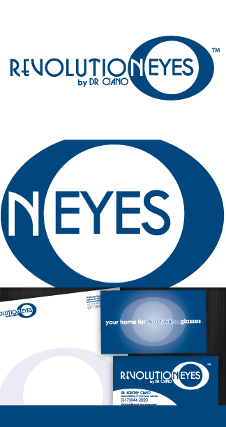
Our challenge was to create a logo which would clearly convey both the modern and edgy part of his brand, along with the serious optometry care he provided. We also had to create something that would look good on a sign hanging outside his building.
We developed a logo using a modern font with a traditional color scheme. The choice of all caps was so the brand would be consistent with the many designers like TOM FORD and GUCCI who always display their name in all caps. The circular eye shape in the background worked well to also serve a mounting plate for their building sign. This look and feel was extended to all their marketing material

Click here to view the RevolutionEyes website.
