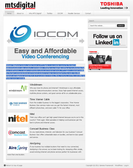
Recently, we had an interesting web design challenge. Midwest Telephone Systems, better known as MTS Digital, a reseller for telecommunications products came to us for a new web site. A B2B company, their products; commercial phones and Internet products aren’t exactly visually exciting.
 Web Design Goal:
They wanted us to create a clean, modern web design which would set them apart from their competitors. It was easy to figure out what they didn’t want – cheesy stock photography of business people on the phone, clutter, confusing buy now pages, or long lists of products and features. The challenge was figuring out what they did.
Using the Genesis framework from Studio Press as a foundation we built a scrolling bar which featured just text information about their services. We updated their logo to a simple text treatment which balanced well against the logo of their primary partner, Toshiba.
The small featured post functionality gave us an opportunity to show off all of the major brands they carry, with links to more information. And the side bar has room for other features if MTS decides to add more later.
We have designed quite a few websites recently, but this is one of my favorites. The simple design allows visitors to figure out quickly if they are in the right place. It looks as good on a smart phone as it does on a desktop computer. But the best part of this redesign came a few days after the launch, when our client called to say he had landed a new customer who found him on the web.
