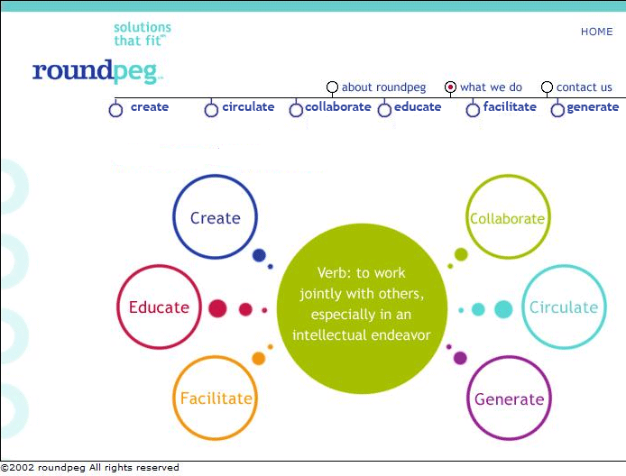
I was looking through some old files recently, and stumbled across some of the files for the first Roundpeg website. Sketched out nine years ago ,it was dramatically different in look, feel and intention to the site we use today. Back then, I was focused on the effect and had several great graphics, with a bit of flash which were fun to watch, but didn’t really explain what we did.
And the navigation bar didn’t help much either. The titles where part of this very clever rhyme pattern I had come up with which amused my friends, but confused my prospects.
So in the second version of the site create became design work, collaborate became team building programs, educate became seminars, and so on…. I still had challenges selling my early product mix, but at least my website wasn’t working against me .
Fortunately, I learned that a productive website does not require lots flash or pictures ( unless you are a photographer or a resort). A great website requires simple navigation and great content which is interesting to your visitors, and attention grabbing for search engines.
Remember that for most websites 75% of your visitors are “first timers” so welcome them, and make it easy for them to find what they are looking for, without feeling silly, lost or stupid. Make them feel welcome, and they will come back

