Humans are very receptive to color. For instance, red makes us think of heat, fire, and passion. But it can also make us think of danger and blood. Blue is a calming color, associated with wisdom and trustworthiness. It’s also strongly connected with masculinity and is highly favored by men.
So take a look at your logo and your business card. Are you using the right colors to attract the audience that you want? For instance, if you’re an accountant who uses purple in your logo, you’ve chosen a color that’s most attractive to children, who may not be in the market for book keeping services. Instead, you may want to choose a deep green, which subconsciously makes people think of money.
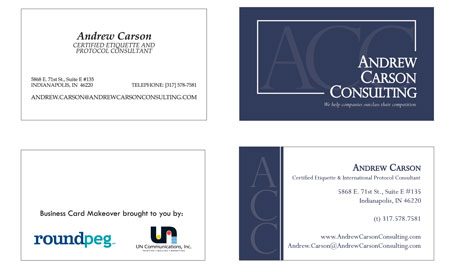
Taylor’s redesign of Andrew Carson’s card for our June Makeover makes great use of color theory. He moved from Andrew’s monochromatic and slightly dull design to a gunmetal blue. This color pays homage to Andrew’s military background, but also ties in with his etiquette consulting business: blue is trustworthy, peacefully, and appeals to the mind rather than emotions.
We’ll be continuing our Business Card Makeover for one more month, so there’s still time to breathe some new life into your card. Just fill out the form below, and you could be a winner.

