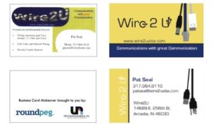
The business card makeover contest has been a lot of fun. We have seen a number of cards which really needed a makeover. Along the way, we have been able to help several business owners.
This month, our intern Dan took the lead on the redesign. Here is what he had to say about the process.
 Although it may be popular, a business card doesn’t need to be a bright color or have a flashy gradient to stand out.
Sometimes, just a strong images can really catch someone’s eyes and portray something about the business at the same time. I’m not endorsing the use of stock photos on business cards, but select graphics, used correctly, can add a nice touch.
While experimenting with the design, for this month’s winner Wire2U, I made a graphic of the AC plug (of which I was kind of proud). I liked it so much, I started looking at other cables to include. Each of the cables which appear on the card is was created from an actual cablet I found laying around my house or at the office.
These cables make the business card more noticeable and interesting, while appealing to people, such as myself, who live with cluttered rooms with countless confusing cables. As for the color scheme, I used yellow to attract attention, but added navy to keep a professional and trustworthy image. Be sure to ask the winner, Pat Seal, for his business card to see it in person the next time you run into him at a Rainmaker Event.
Unfortunately, there is some bad news in this post too. As much as we have enjoyed ridding the world of ugly business cards this will be the last business card makeover .
But, a good brand is constantly evolving, so stay tuned to here and on our facebook fanpage, because there are new things are just around the corner.
