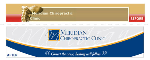
Many of the small businesses we work with, come to us with a “crooked image”. Just like patients visiting a chiropractor, they are walking around, conducting business, just not doing it well.
This was the case with Dr. Jeff Yoder, owner of Meridian Chiropractic Clinic. With a well established practice, his branding did not represent the professionalism of his practice.
He had a simple logo for his practice, which he used on business cards and letterhead. It was not, however, included in his website design, which featured only a generic spine image, that could have belonged to any doctor.
With a practice, serving primarily a professional community ( lawyers and accountants who spend too many hours sitting at their desks) we wanted to give him a fresh, distinctive look that would appeal to this audience.
Starting with new text treatment his company name presented some interesting challenges from a design standpoint. The long middle word made the stacking of the three words seem odd. The initials by themselves MCC looked too much like a local cafeteria.
We finally settled on a design which featured just the “M” in a distinctive font. The addition of a little yellow really brought a some life to the design. Once we finalized the logo, the banner came together very quickly. Then Allison took over and finished the design of the website.
 If you have any web design questions, please don’t hesitate to give us a call at Roundpeg, an Indianapolis web design firm. We’d be happy to help!
