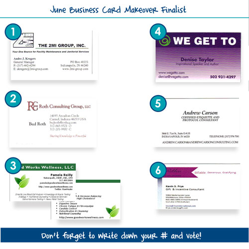
As we continue our crusade to rid the world of ugly business cards–one card at a time, we are ready to pick and June winner. As you are considering which oneto vote for, let’s talk about professionalism. Your business card is a selling tool. Is it projecting an accurate image of who you are and what you do?
Take a minute and view your card through the eyes of a prospective client or more importantly a referral partner. Are they going to be comfortable passing on your card to their best client?
If you’re a lawyer, for instance, your card should probably not be using Comic Sans MS font (Actually, no one should be using it). But conversely, if you’re a wedding planner, you might want to shy away from the traditional, and extremely common Times New Roman.
Your branding is more than just the font selection. All the elements of your card including the colors, images ( please avoid any of the clip art available from Microsoft), the size and shape of the card, and the weight of the paper all contribute to the image your brand conveys.
Here’s the latest batch of cards vying for your votes. Pick the one you believe deserves this month’s free business card makeover!

