At Roundpeg we have worked hard to develop a unique brand, which extends well beyond our logo. Our brand is about positive energy, creativity and collaboration. These three elements are conveyed in the words and images we choose, as well as the way we present ourselves in social media and face to face networking events.
It is important to create credibility with our brand, so clients trust us. At the same time, we know that while we are serious about what we do, we do not take ourselves seriously so our brand incorporates this lighthearted part of our personality, too. As we were designing this year’s holiday card, Lorraine challenged me to create something which would reinforce the brand, with standard colors and fonts, but would also let people see the fun part of our personality.
This is often a challenge for small business who work hard all year long to build their brand image, then compromise on their holiday card. They buy “stock” business cards, which do not convey any sense of who they are to distribute to all their clients and strategic partners; missing an important marketing opportunity.
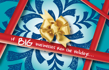
 I enjoyed creating our holiday card this year, because after we redesigned our website, the door was open for creativity and a bit of fun. For the front of the card, I created a hand drawn snow flake , colored in our standard blue and teal so it resembles wrapping paper. Combined with a red ribbon on our hand wrting style font ( Complete in Him) the card has a “hand drawn feel” . The text, “If BIG business ran the holidays”, speaks to our bias for working with small businesses.
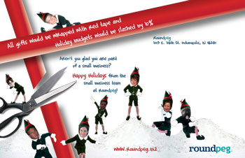
The back side of the card was inspired by a JibJab Elf Dance of the Roundpeg Crew. It gave me the brilliant idea dress all of the team in elf costumes, including Clyde the Cat and Bonnie the dog. Playing off this idea brought humor to the card in a style consistent with our brand.
Happy Holidays to everyone! I look forward to working with you in 2010!
