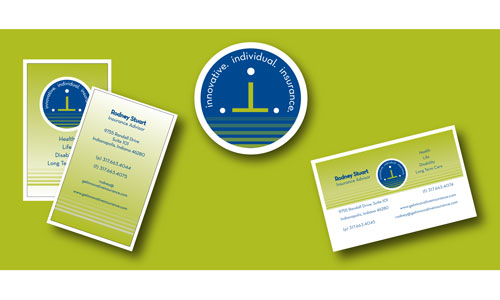
We recently created a new identity for an insurance company, Innovative Individual Insurance, which offers an “Ala Carte” menu of services.
The logo was designed by playing with the letter “i”. The design uses all three i’s to create an interesting layout. The logo came together pretty quickly because our client gave us a good starting point with his vision of what the company was about.
The initial concept was designed first in black and white. We prefer to have a client select the design, and then look at colors. Once the design was finalized then the colors came into play.
The blue and green we selected give the logo a modern, bold, vibrant feeling. The blue is strong enough to use for text, and the yellow/green really makes the logo pop. The color is very vibrant on paper and on the screen.
What do you think?
