by Erica Gardner
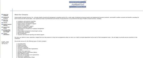
After meeting with United Health Actuarial Services, UHAS, the first thing we noticed was how much their website needed an upgrade. As you can see in the photo, their first website was very plain and simple with no color whatsoever. It looked more like a resume, then a website for a growing group of professional actuaries. It wasn’t hard to convince them it was time for an upgrade which included a bit more color, a few more graphics and even a blog.
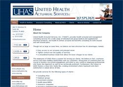
After redesigning their logo, Taylor created a nice banner for the site as well as the graphics on the sidebar. We have a slightly textured background behind the site to give it a bit more color and tie the entire site together. We even included a little bit of “copper” as an accent color. Our client was surprised by the difference a bit of red and copper made to the overall eye appeal. Overall, we think this website turned out great!


