Business owners love lists. There’s something inherently satisfying about ticking off completed tasks, all the while keeping track of the endless to-dos. It’s motivating to see the progress being made.
As a designer, I often see “logo” on business owner to-do lists, making it more of a yes-or-no question: “do we have a logo? Yes? Check.” Finished. Don’t need to worry about that any more.
It’s my job to let them know that you can make a to-do list for your logo. Sure, the origins of the logo harken way back to when it did just one thing: told you whose cattle belonged to who, depending on what mark was emblazoned on a steer’s hind parts.
Logos and the language surrounding them has evolved significantly since then, mostly because there’s only a few of us trading cattle. Your logo lives a lot of different places while still communicating who you are and ultimately looking good without stretching any of the fundamentals.
Nowadays designers and branding firms deal in identity systems. We design a mark that embodies what you want to communicate to the world through your business. And then we put it to work
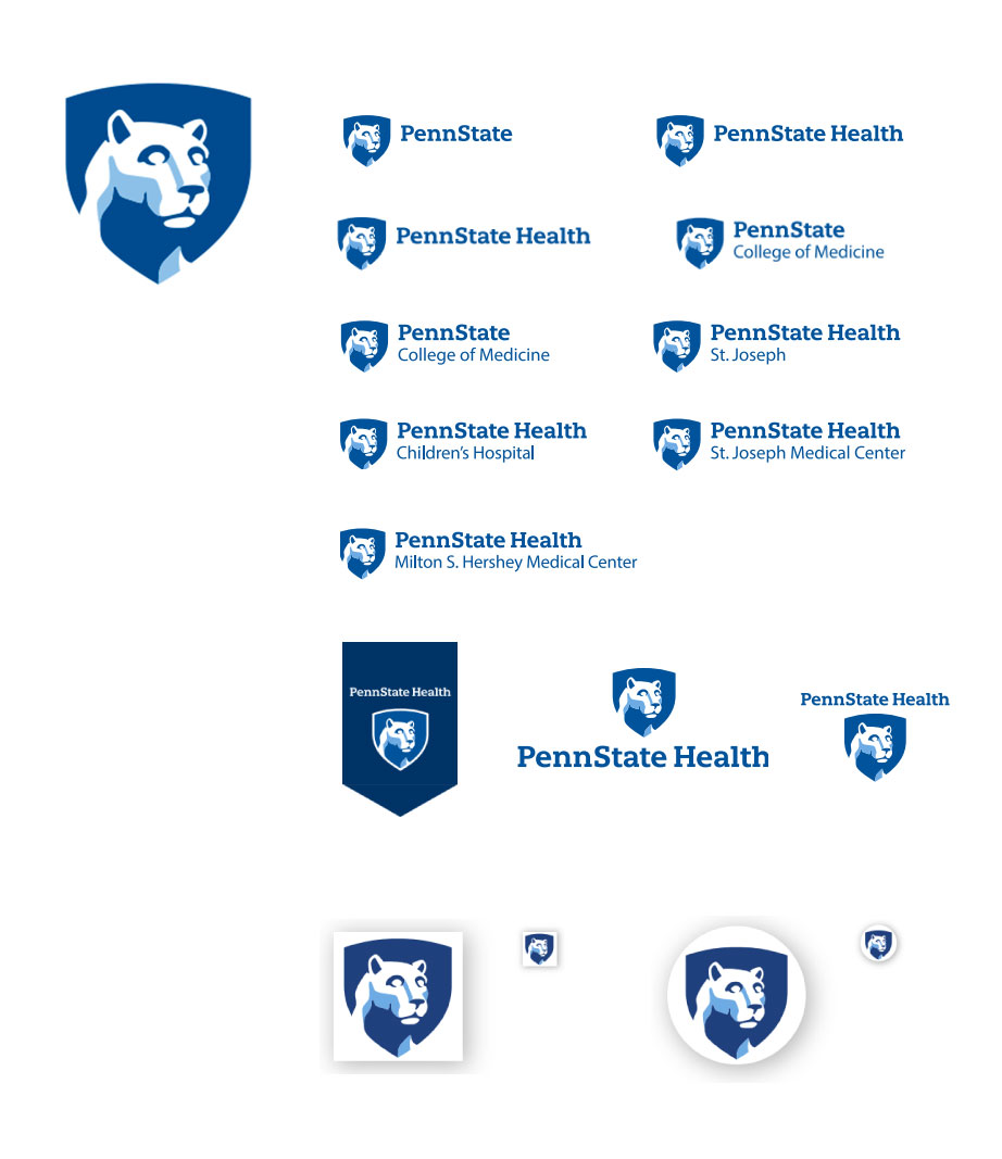
A great example I saw recently was at Penn State Hershey Hospital. Boy does that logo have a lot of responsibilities.
The icon itself readily conveys a steely, trustworthy message with a simple lion, shield and blue color scheme. Not exactly the warm, friendly tones hospitals are adopting for a more pleasant patient experience, but you know you’re in good hands.
Below are all the examples of different configurations of the logo. It’s not exactly shiny or glamorous and it doesn’t need to be. It does its job very well by creating space for listing a specific campus, building or department underneath the main logo. When bewildered patients are trying to get to their appointments on time, logos and wayfinding systems are essential in making that a smooth process.

So maybe you aren’t running a multi-facility health organization with several locations. What can your logo and accompanying identity system do for you?
Sets a Tone
When I see logos on t-shirts, mugs and business cards, the message it sends is “this belongs to me.” That’s nice. If it’s yours, then you keep it. Which is not what a marketing and sales rep wants to hear.
Ideally, everything your logo touches should serve a purpose and provide something interesting. In the case of the Penn State Hershey Hospital Identity system, the value of the logo told you where you were at and served the interest of your personal health. People find their own health inherently fascinating, so on-site, the logo markets itself.

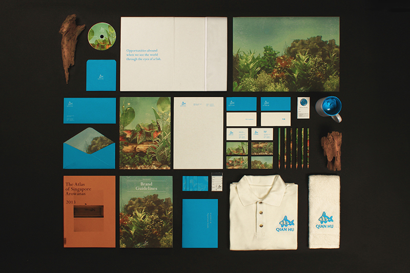
Darius Ou Dahao opens his project with “Qian Hu Fish Farm is a global integrated ornamental fish service provider and manufacturer of aquarium and pet accessories. They were pioneers of the industry in Singapore, with a strong history dating back to the 1970s.”
This is what he came up with, and not only is it stunning, but it suits the project perfectly in one glance.

Logo of a fish? Check. The vintage illustrations of aquatic plants tell you there’s something different about this fish farm. You don’t see those every day. The rest of the color scheme, with the pop of bright blue, carried out in unique ways across all sorts of materials, tells you exactly what this fish farm is about without reading a single word.
Makes You Social
Who would have thought a service college students used to stay in touch would define another set of logo parameters for multi-billion dollar companies. Facebook, and all the other social media platforms force your logo in new directions. Not only does it have to look good on business cards and t-shirts now it also has to look good on social media too. That means it has to fit well in both a circle AND a square, which is more difficult than it sounds.
There’s also the issue of what to put as the header image on social accounts, or the bigger image that provides a backdrop to the profile pictures. Sure, you can just pop a photo of smiling faces or a solid color, but minimal effort reaps minimal rewards. It shows you don’t take your social presence seriously, and neither will any followers you manage to accrue.
The header image is a great place to put custom photography or better yet, part of your identity system, which often comes with its own unique set of icons and patterns. Make it look and feel like you.
Moves
Logos have been laying down on the job, but no longer. In a digital space, they dance. Some logos are more talented than others, but any two-step will do. Our eyes naturally gravitate towards things that move, so your logo will stand out. If your logo’s got the moves, a viewer will think “oh that’s cool!” which is a +1 in brand recognition and developing a favorable history with your future customer. Curious what this looks like? Here’s a couple of ideas to set you in the right direction.
That’s quite a list for such a simple image, but it’s carrying a lot of weight on its shoulders. It encapsulates everything your brand means to your customer at a glance. Attention to detail is essential, and well-considered applications are crucial. If your logo isn’t doing that for your business, ask your designer why and what needs to change. Put your logo to work.

