Good design is awesome! Surely we can all agree on that. But why is it so great? Well for one, things that are well-designed tend to look nice. But any good designer knows you can put as much time into the aesthetics as you want, but if the function is flawed, it doesn’t matter how pretty it looks. It’s a failure.
Whether you’re designing a brochure, an app, a website or even a car, it has to align with the needs of the customer. The tricky thing is when a design is good, it tends to go largely unnoticed. Sure, someone (probably another designer) may go “wow, this is attractive and functions perfectly!” but the average person is only going to call attention to a design if it has flaws.
Design mistakes and errors in judgement happen, there’s simply no way around it. Some mistakes are easy to fix, others have lasting and potentially devastating effects. Here are some notable examples of poor design choices and the unfortunate results.
2017 Oscars:
Unless you live under a rock, actually even if you DO live under a rock, you know about the awkward Oscars mix up. La La Land was announced as the Best Picture Winner after Warren Beatty was given the wrong envelope. Moonlight, the true winner, did eventually get the prestigious gold statue, but only after one of the most chaotic and confusing awards show exchanges of all time.
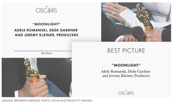
Obviously this mistake was partially due to human error. Someone delivered the wrong envelope. However, it was quickly pointed out that with some extremely simple design changes, the embarrassing fiasco could have been avoided altogether.
A design with more hierarchy, like the one created by Brandon Jameson, and shared by Fast Co., would have solved all the obvious issues of the Best Picture card. Jameson simply reorganized the information, used some bold type for the name of the winning film and voila!
Hopefully the people over at the Oscars sent Jameson a fruit basket or something.

Three Mile Island Accident:
This was the most serious nuclear power plant accident in U.S. history. Fortunately, it ended up having little or no affect on public health, but it very easily could have hurt or killed many people.
In 1979 the nuclear plant, which was located in Middletown, Pennsylvania, experienced a mechanical malfunction which triggered a series of dangerous events. Systems failed, valves which should have been closed were stuck open and nuclear reactor coolant was able to leak for several hours.
Why wasn’t anyone doing anything to stop this leak? It turns out the extremely confusing design of the control panel was a major culprit in the lack of response to this accident. The workers didn’t realize the valves were stuck in the open position, because the system lights and status indicators implied the valves were closed, when in fact, the lights they were seeing simply meant the system was powered on, and had nothing to do with the valves being open or closed.
Better labeling and organization would have allowed the workers to quickly assess and correct the situation.

Lincoln Start Button:
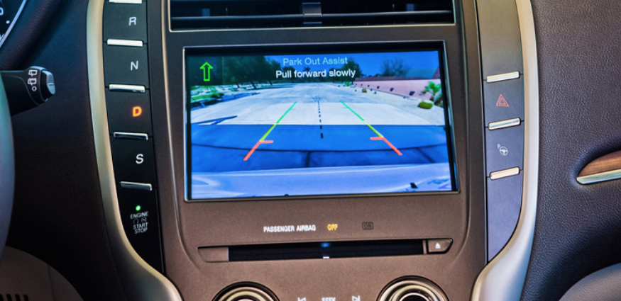
A recent example of terrible design was the 2015 Lincoln MKC. Instead of being in an isolated or more prominent area, the Start/Stop button was located right below other controls that would commonly be used while driving. As a result, drivers were inadvertently shutting off their vehicles while in motion.
Obviously this is dangerous for a number of reasons, and Ford was forced to recall the vehicles. This feels like a classic example of a design that put aesthetics over functionality, and it backfired in a really terrible way.

Butterfly Ballot:
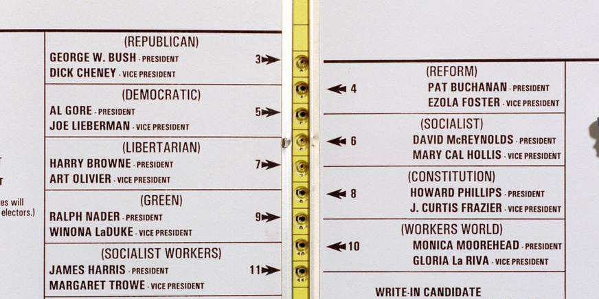
This is another infamous example of design doing much more harm than good. During the presidential election in 2000, a confusing ballot layout in West Palm Beach Florida may have unintentionally cost Al Gore the presidency.
Odds are you’ve heard this story and seen the images before, since the confusion and chaos spread nationwide.
The person in charge of laying out the ballot design admitted it was a mistake. Her intention was to split the ballot on two pages to keep the font size large enough for the elderly to read more easily. However, the decision caused people who assumed they were voting for the Democratic candidate to accidentally choose the Reform Party button, because it was directly below the Republican button.
Design mistakes can be avoided.
The moral of the story here is simple, albeit easier said than done sometimes. Designs should always meet the user or customer half way. People are going to use your product in a way that is natural to them, so it’s crucial to create with that in mind. Before launching that new app, website, etc. you should always test it on the people who will be using it. There’s a good possibility they will draw attention to design mistakes you wouldn’t have seen on your own.
Good design combines the knowledge of design principles and technology with the nature of the humans interacting with it. The more seamlessly those things are combined the more successful a design will be.


