Delicious Design from Day to Night

Toast restaurant is really two restaurants in one.
From dawn through dusk it is a typical neighborhood diner, featuring eggs, dishes hot off the griddle and sandwiches.
But as the sun sets, the atmosphere changes and Toast becomes a destination for cocktails or an upscale dinner.
The Challenge:
The owners of Toast approached us to create branding and a website for a restaurant that was still just a twinkle in their eye.
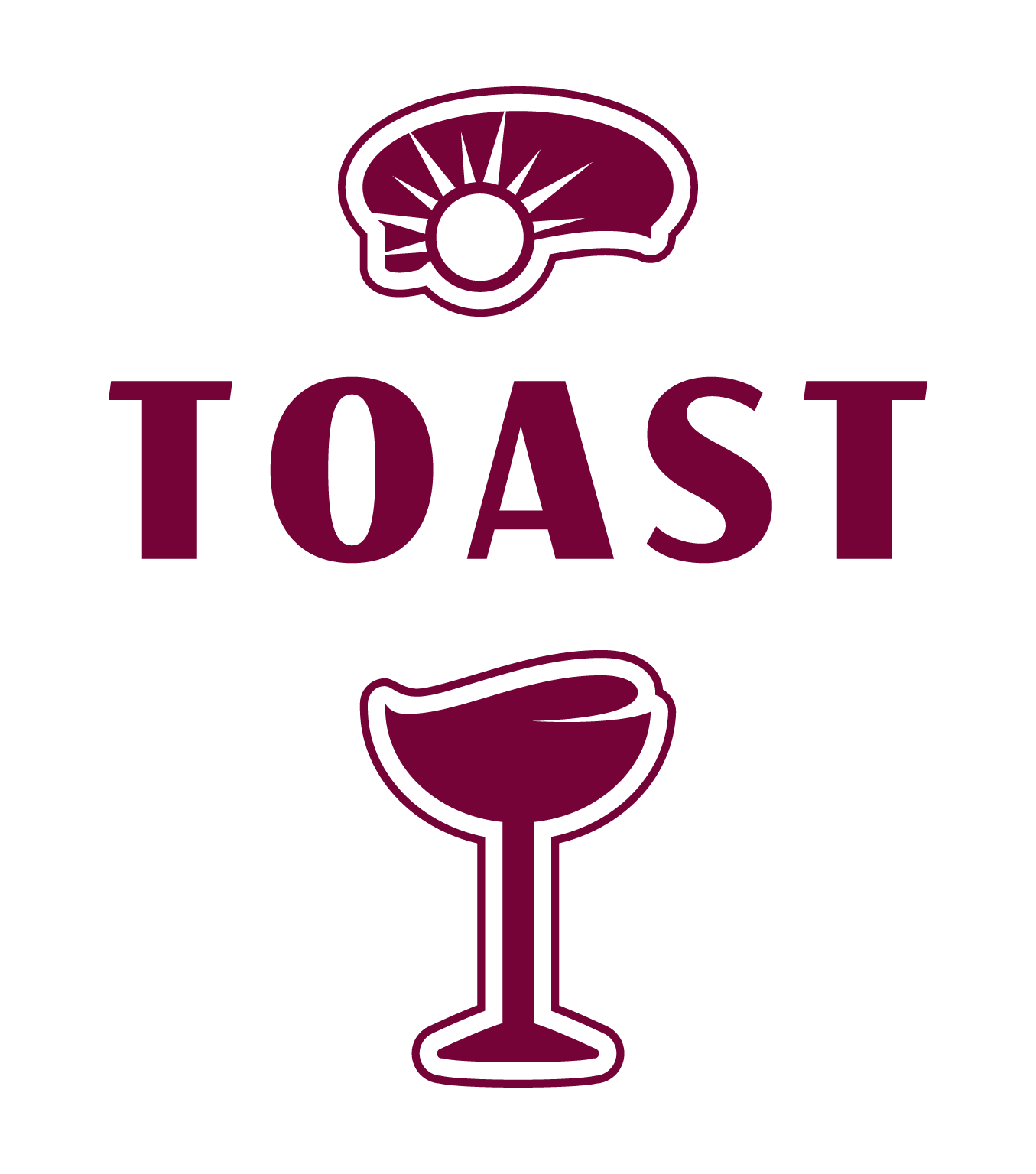
Their vision for Toast was comfortable and classy with a spark of humor. They wanted us to be sure to include the visual pun of a piece of toast (hinting at breakfast) and a wine glass (toasting a special occasion).
Design Goals
- Convey the restaurant’s approachable atmosphere and quality menu.
- Present the two separate but connected elements
- Convey a dawn to late night style
- Carry the colors and design through print, social media, and web design.

Sunrise and Wine
The logo combines elements which speak to both parts of the day: Toast in the morning, wine in the evening.
Look closely, there’s lots more going on in this design. The subtle lines of the bread perched on the half-filled glass hint at the idea of a sunrise. And the overall shape of the logo looks like a giant T (for toast).
The elements can be separated so the toast can be used on a breakfast and lunch menu and the wine glass can be used to signify the dinner selections of the menu.
About the Colors
The rich wine color is their primary color and is featured throughout their website. It is dark enough to be used for title text and eye-catching enough to draw the eye to buttons and calls to action.
Complementing the wine is pale beige used sparingly to give a little warmth to the website.
About the Logotype
You won’t find the font we used for their logo in any font library. This was hand-drawn for Toast, lending a unique retro aesthetic they could claim for all their own.
To accompany the logo we recommend Avenir, a simple, clean font be used for all other forms of body text, on the website, menus and other marketing material.
About the Website
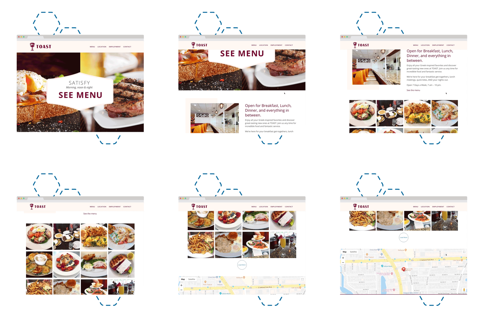
When it comes to food marketing, nothing tells the story better than pictures of the food itself.
That’s why we added a feed from their Instagram account to the home page. That way potential diners can browse through images of the latest delicious dishes.
The other benefit to using Instagram is that the busy team at Toast can essentially add new images to their site, without ever logging in to the back end
The Results
Toast is open for business, serving up delicious meals from dawn to dusk.
If you are in the Ft. Lauderdale area, drop in and have some toast!

