What Is a Website Navigation Bar?

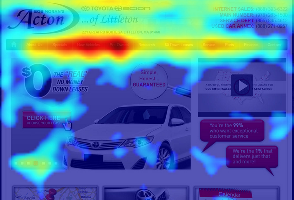
Image credit: https://growtraffic.com/blog/2015/03/3-free-tools-see-heat-map-your-website-visitors
This photo of a sample web design’s heat map is based on tracking the number of clicks and mouse activity that happened over a particular area of the design. The photo uses intense red and orange shading over areas with lots of clicks and activity. See how the website navigation bar is nearly totally covered in red while the home page is just dotted with hot spots?
Since it gets so much of our visitors’ attention, let’s take some time to dive deep into what makes a good website navigation bar. I’ve broken it down into five topics.
- Use Descriptive Navigation Labels
- Limit Navigation Items
- Prioritize Navigation Items
- Avoid Drop-down Navigation
- Be Open to Mega Menus
Use Descriptive Navigation Labels
I should be able to read your primary navigation and know in seconds exactly what your business does. For example, a local brewery with a restaurant should have a navigation that reads: Home, Brewery, Beers, Events, About Us, Contact Us.
The first real navigation item is Brewery and like a flash of lightning visitors know what they’re getting into. But what if that navigation was written another way, like: Home, Menu, Products, Events, Contact Us. The word Menu tips me off that there’s a restaurant but it has lost all other shades of meaning. It’s too vague.
Use clear, specific and descriptive navigation labels to make it easy for customers to choose the relevant navigation item. Check out more examples below.
Vague
Home, Services, Portfolio, Contact
Clear and Specific
Home, Marketing Services, Design Samples, Contact
Vague
Home, Get Started, Spotlights, Resources, Blog, Contact Us
Clear and Specific
Home, Holistic Wellness, Featured Products, Free Resources, Blog, Contact Us
Even when the items at the end of your navigation list are more generic (they often are), simply setting the tone with specific starting items will immediately clear up confusion.
Limit Navigation Items
As you plan your primary navigation, limit the number of items to five or seven. Working with this restriction might seem impossible. I know I’ve worked with clients who needed to squeeze in just one more. However, fewer options to start with keeps your visitors on task. Some research shows that humans only keep five to 7 items in short term memory. And my personal experience shows that I barely remember where I left my coffee cup two seconds ago. Less is better. The fewer you have, the greater the prominence for those items that remain.
Limiting your number of navigation items also forces you to keep the whole website outline organized. You’ll have to carefully group and link related pages in a logical fashion rather than letting them spill over into a tedious tangle of terms.

One other reason for limiting the primary navigation items is that your navigation bar has a real space limitation. You can only have so many words on one line before they spill onto a second line of text, which is guaranteed to look untidy and broken. The only way to address this problem at the root is to limit the number to start with. I recommend five, with room to try and fit up to seven. Eight is a no-go. Sorry eight.
Prioritize Navigation Items
Start your primary navigation with important, obvious things. End your navigation with important, obvious things. Items at the beginning and end of lists are more easily remembered while anything in the middle has a greater chance of being lost. This is why it’s important to start your navigation with something that specifically reveals what you do (like “Brewery” in the examples of descriptive navigation). Visitors will remember that. Items of lower priority should then follow.
Things change when you get to the end of the navigation. Suddenly you’ve finished the list and visitors are again likely to remember those items on the very end. I often design websites so important menu items Donate and Shop are styled as colorful buttons and placed at the end of the primary navigation.
Avoid Drop-down Navigation
Pick-lists, or drop-downs, are a cop-out. As a web designer and website planner, they let you loosely throw groups of pages together without thinking about it. “Aww, it’s on the drop-down so I guess people can find it now.” Unfortunately, this is why visitors think your website is annoying.
Drop-downs require fine-tuned mouse motions to operate, especially when your drop-down goes two or three levels deep. Don’t you hate it when you’re about to click something, but it changes or disappears at the last second? This is a website usability error that’s gotten a lot better across the web over the years, primarily because websites have been dropping their drop-downs.
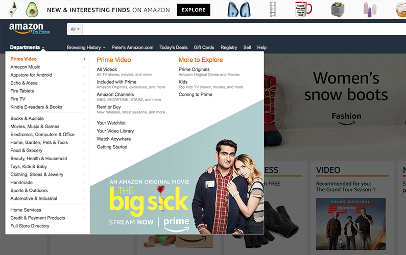
But what if you’re stuck with a website outline that overflows the primary website navigation? If drop-downs are so bad, then what’s Amazon doing with this enormous list of 20+ items?

Be Open to Mega Menus
The screenshot above shows Amazon’s Departments menu. Yes, it drops down. But it’s not a drop-down, it’s a mega menu.
These oversized menus are designed to expand and fill a greater amount of horizontal space on the screen. This allows you to organize the items in a more pleasing grid beyond the limitations of a vertical list. They successfully avoid some of the irritation of traditional drop-downs. However, the application of mega menus is limited. They’re the exception. You get just one per website.
If everything in your navigation triggers the appearance of these extra-large selection menus, then it just gets irritating all over again. Notice how Amazon has other design elements that drop down, but Departments is the only one we can call a mega-menu.
I bring up mega-menus just to share another option for organizing your website navigation. Sometimes you can easy-peasy slot your pages into a minimal, clean layout. But if you can’t, then it’s ok. You have creative options!
Today we’ve reviewed five topics to reveal what makes a good website navigation bar.
- Use Descriptive Navigation Labels
- Limit Navigation Items
- Prioritize Navigation Items
- Avoid Drop-down Navigation
- Be Open to Mega Menus
I know it can be wrenching to think about reorganizing the site to improve the navigation, but if you’re really concerned about providing a top-quality visitor experience, then you’ll make the investment.
References
https://www.orbitmedia.com/blog/website-navigation/
https://www.nngroup.com/articles/does-user-annoyance-matter/
What do you think? Do you have questions about your current website’s navigation? I’m @pwolfgram on Twitter, feel free to check in there or leave a comment below and we’ll be quick to answer. Thanks!
*Although your navigation is important, your footer is something you don’t want to let fall by the waste side. Check out our Do’s and Don’t of Your Website Footer!

