When we first moved to Indianapolis more than 20 years ago the food scene was a dismal mixture of chains and local places to get a pork tenderloin sandwich. Now don’t get me wrong, after more than two decades I have come to appreciate a good tenderloin, but only in small doses. The rest of the time, I enjoy innovative menus and unique dining experiences.
Fortunately, these days the Indy restaurant scene features both. There are so many in fact that it is hard to keep up and I find myself checking out their websites to determine where I should go for dinner on a random Saturday night.
Mobile First
Every industry needs to be thinking about the user experience on mobile devices, but this is especially true for restaurants. On any given night a significant number of potential customers will pull out their phones, do a search and land on your website. So that’s where I went first and all the screen grabs you see below are from my phone.
Judging Restaurant Web Design on My Phone
So based on their websites alone, here is my assessment of some of the newest Indianapolis restaurants.

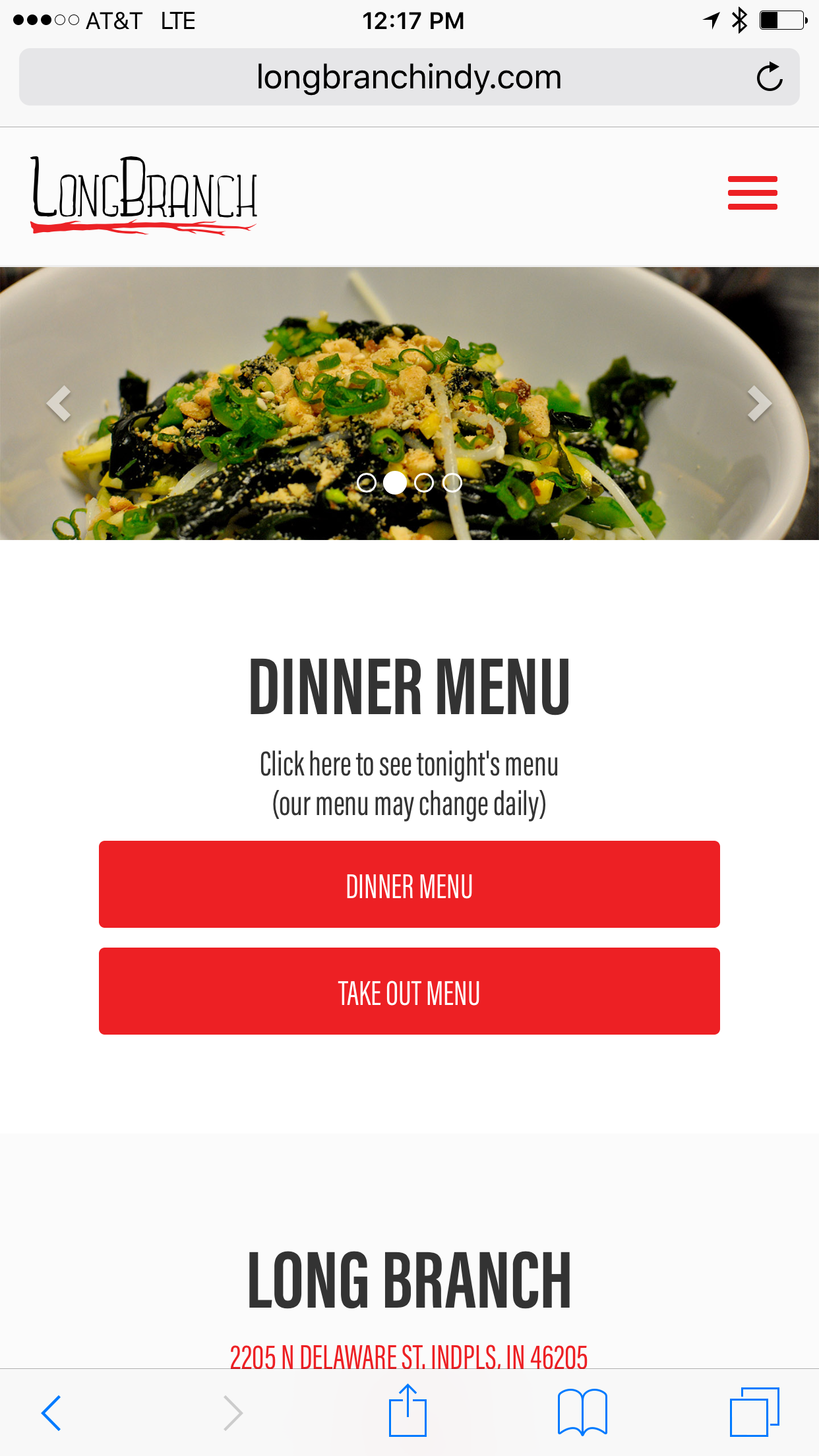
Long Branch – http://www.longbranchindy.com/. Described as a quirky, Chinese inspired restaurant, the home page photos made me hungry. The site is fairly simple but has the basics.
On the mobile version the menus loaded quickly and were easy to read and browse on my phone. I was happily surprised when the address opened a map program as soon as I clicked.
The desktop version was a little disappointing. First there was awful music which began on autoplay. If I was in an office with a lot of people, that would have been very disturbing. On Firefox, the menus downloaded to my desktop instead of opening. Perhaps that is a flaw in Firefox, but if that is the user’s preferred browser they probably don’t want menus cluttering up their files.
Restaurant Web Design Ranking: 4/5

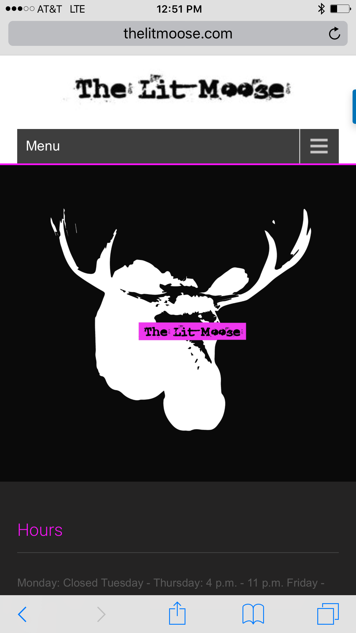
The Lit Moose – www.thelitmoose.com – features a huge menu filled with what they call New American Cuisine. Since there are no pictures, I am not sure exactly what that is. The large logo dominates the home screen. It is nice, but irrelevant. Branding is important, but not when it gets in between your customer and the information they really want.
I guess the site is supposed to be hip and cool, but the black background of the entire website is unappetizing. I could hear my mother saying how food always looks better on white plates. The black background gave the restaurant a dark feel that seems out of sync with what is supposed to be a kid friendly place. On the good side it is really easy to scroll and read the extensive menu.
The map was clear so visitors can easily find their way to the restaurant, but the hours of operation were harder to read. Why is that information presented in grey when the rest of the site was a very bright white? Do they not want you to know when they are open? On this page there is a large phone number which did not launch my phone to call. That seemed a little odd. I had to scroll down to the footer for that. It isn’t a huge deal, but a bit of a turn off when I am in a hurry.
The separate tab to make a reservation using Open Table was a nice touch but as a new restaurant I would recommend that be placed after the menu in the navigation line. As people are trying to get to know you they want to know what you serve before they make a reservation.
Restaurant Web Design Ranking: 3/5

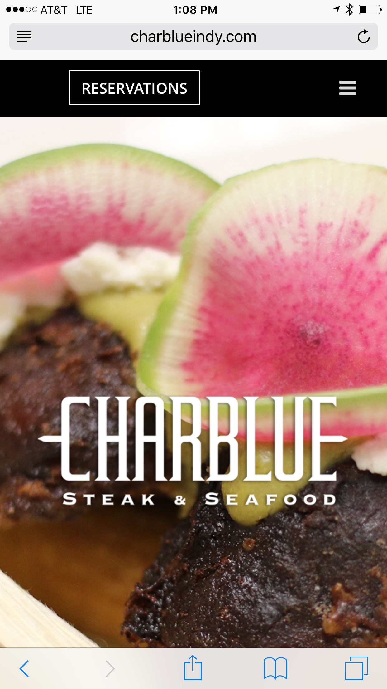
Char Blue http://www.charblueindy.com – an upscale steak place – it is clear they are banking on the name of both their owner and chef. Just below the mouthwatering image on their home page is a lengthy bio of the owner and chef. While interesting, I wanted to see the menu and that was less obvious. In order to find the hours, map and phone number I had to scroll through a very long home page.
It is clear reservations are their top priority. Big, bold, and presented in a separate box makes the reservation button really easy to find and easy to use.
The photos are lovely giving the entire site an upscale and elegant feel, but they slow the site down. It is a tough balance to present beautiful images which also load quickly. They might want to consider a smaller image on the menu page, so a visitor doesn’t need to wait to see the menu. Once it does load, the menu is clear and easy to read.
The additional information on private dining is extremely helpful, though I would add a contact form on this page to make it easy for someone to book a room.
Restaurant Web Design Ranking: 4.5. Clearly the most expensive of the sites I looked at, but also the one I am most interested in checking out.
Are you hungry yet? I know I am. Before you rush off, here’s a quick list of things a restaurant website must get right:
- Great photos. If your food doesn’t make me hungry, I am likely to keep looking.
- Menus and pricing. Visitors want to be able to assess quickly if you serve dishes they want to eat and can afford.
- Directions, phone number and hours of operation. There is nothing worse than getting lost on the way to your restaurant only to arrive and find out that you are not open on Monday. The easy one touch to open a map program is mandatory.
- Optional. Do you accept reservations?

