We talk a lot about Facebook advertising. Whether it’s worth your time and money (spoiler alert: absolutely), how to set up a winning campaign and how to take advantage of targeting very specific audiences.
Print ads are still alive and well (and thriving in some corners), but consider how many times you pick up a magazine vs. scrolling through your Facebook feed.
Yesterday I scrolled taking note of which ads caught my eye and which ones were comparatively repellent: “7 Early-Warning [sic] Sign of Rectum-Cancer,” replete with terrifying emojis, anatomy illustration and BONUS a grainy image from the perspective of a colonoscope (I took a screenshot for proof but will spare you. If you don’t believe me feel free to email with the subject line “This is why we can’t have nice things.”)
It struck me how often I could tell what kind of company/service/product the ad was selling before I read any of the copy. Take this one, for instance. Take a stab at what they’re trying to sell you. I’ll wait.
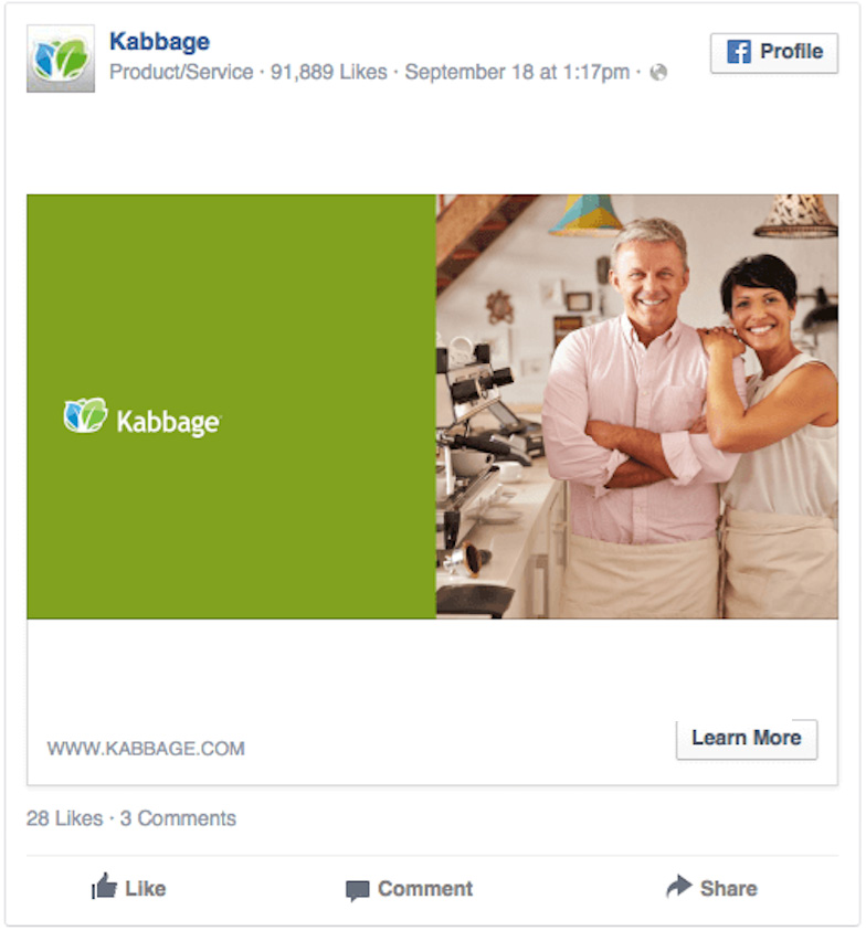
On the left, a big block of gr$$n with a sensible-to-modern font. On the right an adorably caucasian couple pleasantly skipping to middle age pausing momentarily from making espresso in a tastefully decorated room.
As a designer, I could intuitively discern this had something to do with finances, be it banking or bookkeeping or the like. All of these decisions are made to intentionally, subconsciously communicate the message before you read the copy.
The Actual Ad

Pro Tip: When you’re designing your Facebook ad, keep in mind what you’re saying without using words.
Try it again with this one.
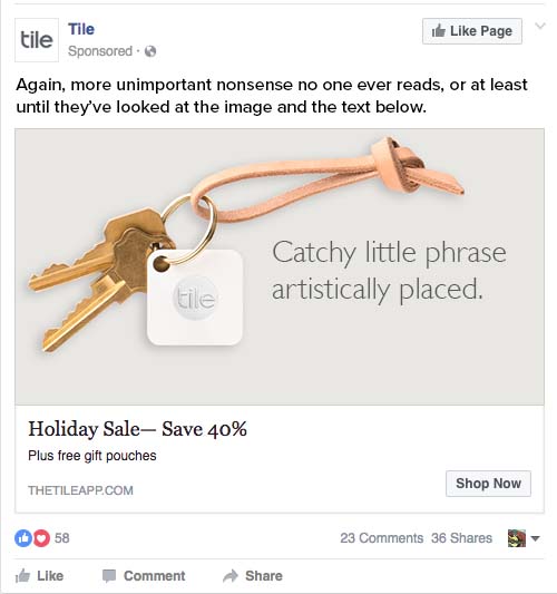
This ad features a light color palette (which from my perspective doesn’t stick out), a rather thin, modern font, and the clincher—a light brown leather keychain. Who’s this ad for?
Younger people (more specifically, hipsters) who apparently don’t need more than two keys, are attracted to clean, bright aesthetics and leather goods make them feel “earthy” and “natural.”
The Actual Ad
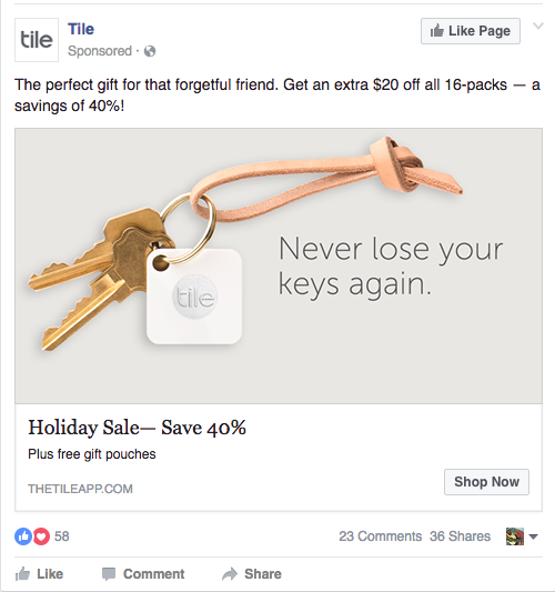
Pro Tip: Select colors, fonts and images which are consistent with the styling of other products and services your prospective customers are likely to be interested in.
This next one intrigued me since the imagery directly contradicts the overall target message: “buy this to celebrate the holidays.” I get it, Vikings are scoundrels, not plush toys. But I really don’t want to have to pry my whiskey from the claws of the ghost of Christmas Past, thank you.
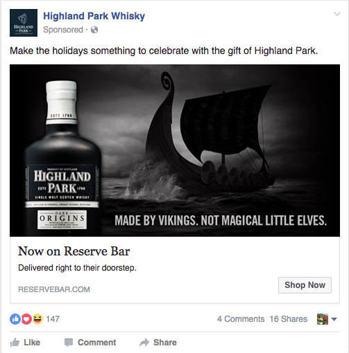
Pro Tip: Select images which tap into the emotions of your prospective customer.
All right, enough snark. Here are some ads that follow the rules of how to grab your attention, not look cheesy in a bad way and have a consistent message.
Tough Mudder – Happy People – Consistent Color
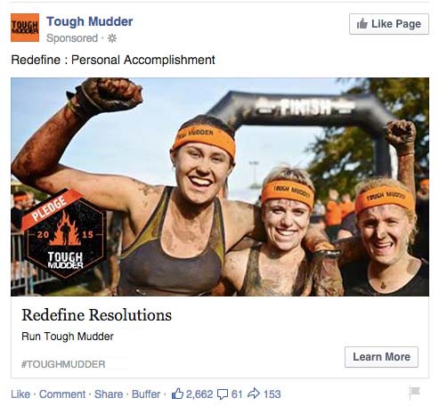
This Facebook ad follows the number one rule of advertising: smiling faces.
These women are exultant after completing a rigorous obstacle course. Bonus for using women given the target audience (me, a female) and the consistent use of orange throughout the ad without being obnoxious.
The overall composition, sliding from the triumphant fist to the final smiling face is also quite nice.
Pro Tip: Photos of people range from creepy stock photos to genuine images. The more realistic the people look, the more effective the Facebook ad will be. Remember you are competing with real images of real people in the timeline. The more your ad looks like typical content, the more likely people are to notice it.
The New York Times Wins with Simplicity
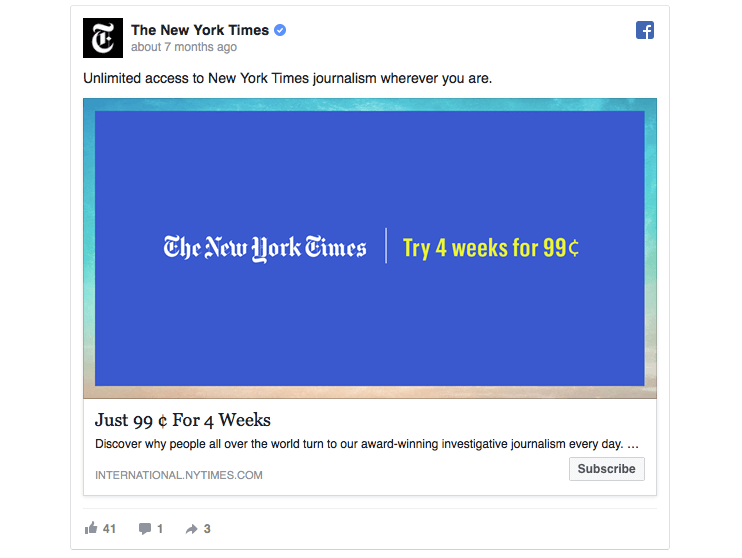
This one stopped my scrolling in its tracks. Not unlike real estate in New York, space on the internet is at a premium. While the internet paparazzi is clamoring for your attention, this ad is the guy leaning on the bar with a martini and wearing a bespoke suit. He doesn’t shout to get your attention. And yet, he’s the one who sticks out.
The neon purple (or blue, I can’t tell) is a bold choice for a 165-year-old publication and may be a bit patronizing towards their younger audience, but it worked. It got me to stop and pay attention.
Pro Tip: Sometimes less is definitely more
And I’ll leave you with this.
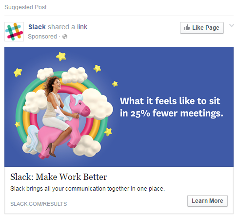
This wins all the things. Slack knows exactly who they’re talking to as well as the secret handshake. Who enjoys meetings? No one. What does it feel like to sit in 25% fewer meetings? Beyond your wildest dreams. But not just any dreams, dreams specifically referencing a popular internet meme (unicorns are the best) and doing so in a hilarious, nonchalant manner—but with professional/good photography and illustration.
This Facebook ad would fall utterly flat with a stock illustration. The overall effect of this brilliant ad puts a smile on your face, regardless of whether you want anything to do with Slack. But you’re intrigued now, right?
So what do we learn from a brief stroll through what Facebook thinks I’m interested in (they’re not wrong)?
Keeping copy short, targeting your audience and staying relevant are incredibly important to creating an effective Facebook ad, but next time keep in mind what your visuals are saying subconsciously before your next customer has a chance to read.

