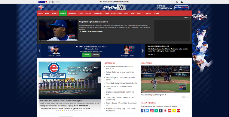
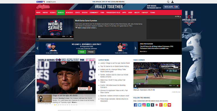
So I had this brilliant idea for a blog post! It was timely, interesting and right up my alley: a World Series Website Smackdown! I was going to compare and contrast the Cubs and Indians’ websites and decide – no matter who won the World Series – which organization had the better website. Cool idea, right?
Well, I was quickly disappointed to learn that both websites are EXACTLY THE SAME, with the exception of different pictures and graphics. Major buzzkill.
But, from disappointment sometimes comes rebirth!
Instead of the contenders for the World Series, I got to thinking about the beast itself – MLB – and how their website stacks up against the other professional leagues of the NBA, NHL and NFL. We did something similar when we looked at the best of the best in Indy sports, but today I’m dreaming big.
With all the money these leagues make, you would think/hope they would be able to put together some really slick and cool web designs that we may be able to learn and take some pointers from? You would think.
Major League Baseball
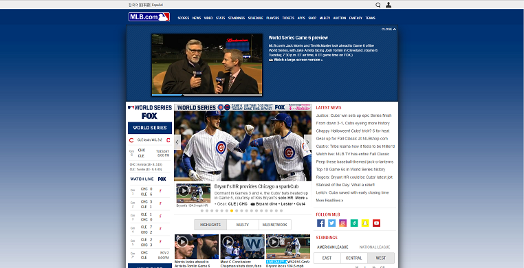
Obviously this time of year the website is going to be pretty focused on the World Series, so we may not get a pitch-perfect view of the site’s potential. However, there is enough here to work with, and it is not too impressive.
The first thing I noticed about the site was that everything is soooo crunched together. The website is so desperate and eager to give you everything at once that it honestly hurts my brain to look at. There is absolutely no natural flow or calls to action as everything competes for attention all at once. Not to mention it has auto playing videos and a crazy amount of dead space, two things that drive me nuts about websites.
The site does give you the necessities: stats, standings, game scores, times, ect. making it by definition a league website, but if you are going to take something away from this site it would be to not take anything from this website.
In a league in which Giancarlo Stanton signed a 13 year $325 million contract, you think they could be bothered to invest a little time and money into making their website not terrible. Just a thought.
National Basketball Association
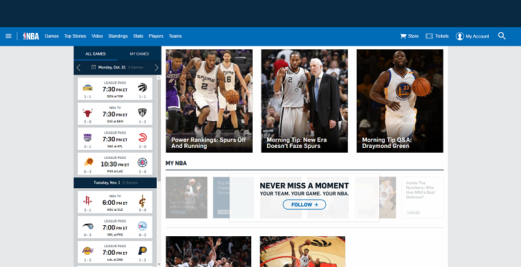
Ok, we are looking a little better here! Better separation of sections makes the NBA’s website much more manageable to navigate, with larger pictures to help break up the text. And is that a call-to-action button I spy!?
The game navigation bar is also presented much better and follows you down the page as you go, which is a nice feature. You can also make an account and customize it. A nice way for the NBA to add your email to their list.
The big take-away from this website is that pictures are always a great addition to any page. They help break things up and help draw in interest, keeping people browsing for longer.
They do a much better job of not wasting space and the website actually looks like a little work went into it to polish it up. Nice job, NBA!
National Hockey League
The NHL’s website is up next and it is fine. Not good. Not bad. It’s fine. Just by looking at it I’m sure you can see what I mean.
They do a really nice job of presenting you with a featured image right off the bat to grab your attention. The content is all solid – they even had a fun little gallery of NHL players dressing up for Halloween which was really cute. It is easy to navigate and gives you easy access to all the info you would want out of the page… but the website is just… boring!
There is lots of empty space. Now, if you HAVE to have empty space, at least don’t make it white – which is exactly what this site does. Inject a little color, a little excitement into your website for crying out loud.
That was my biggest take-away from this site: solid content alone won’t keep people engaged and coming back. Give your website a little something special to make it stand out.
National Football League
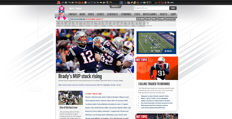
The NFL is our last stop, and they have what I would consider the strongest website of the four.
On first glance, it brings back the same crunched feeling that the MLB website had, except they play it much better. Not only do they actually give each section some room to breath, but they effectively use borders, effective headlines – like the Hot Topic tags – and different colored backgrounds to break it up even more and establish each area as a section of it’s own.
That would probably be my biggest take-away: you can effectively show gobs of information at once if you present it in a smart and efficient way.
On a side note: they also have a super responsive and fast web team. The breaking news shown on the picture above had just happened and already they had coverage and analysis of it. So, kudos NFL!
Some other things the site does well is to provide an easy to navigate top menu and give links to each individual team’s website, which is very smart and convenient, and it is by far the best looking based on the eyeball test.
They do waste a lot of space and have an auto playing video, but the website does so much else right that I am willing to look past it and give it my seal of approval of best of the four.
So there you have it, another thing the NFL does better than everyone else! Curious about how you apply some of these take-aways to your website?
Grab a copy of our Web Kick Off Guide or have a conversation with our web team. Roundpeg can help you unlock the hidden potential of your website, or build you one from the ground up.
Roundpeg is an Indianapolis web design firm.

