Most people mark the change in weather by packing up their summer shorts and tank tops and dragging out their warmest sweaters from storage. I know the time of year by whether I’m drinking my coffee iced or hot. The last vestiges of warm weather are trying to hang on, but I definitely appreciate a steaming cup of brew for these chilly November mornings.
As such, I gave another shot at rating local Indy coffee shops by their website. If you missed my first post back in June, you can read it here.
Calvin Fletcher’s
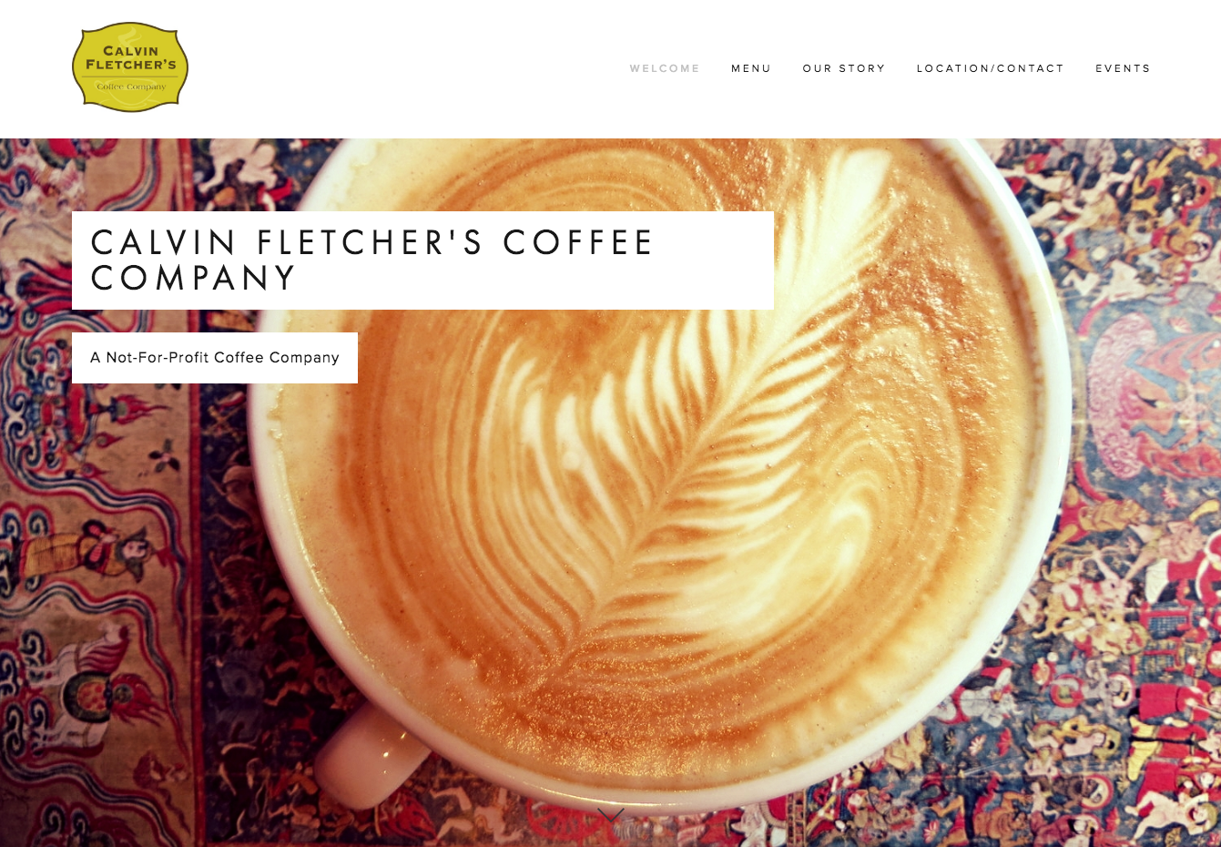
I’ve liked the homepage of the site since I first set eyes on it when I moved to Indianapolis. It’s clean, it’s pretty, and the medieval-looking art underneath the latte art is interesting enough for me to keep clicking around to see what they’re about.
Fortunately, they tell you within half a scroll. They’re good at coffee and active in the community. Oh really? Tell me more.
In the first year they are consistently profitable, they plan to give away at least $5,000 and offer neighborhood and greater community service projects. Great idea, right?
Back to the website. In and of itself, it’s pretty standard, though I appreciate the use of pictures sprinkled throughout. What I love about this site is the successful use of story to keep you engaged and earn your support. Calvin Fletcher’s speaks for itself which is the goal of any brand, and the website is just a mouthpiece to raise awareness. Well-done.
Rating:

Calvin Fletcher’s has all the necessary parts and uses story to guide viewers through the website. Nothing exciting, but well thought out.
Thirsty Scholar
Thirsty Scholar is unique in that it provides beverages to either calm your nerves, hype you up or both. As someone who grew up in Pennsylvania with quaint liquor laws, this prospect is thoroughly intriguing.
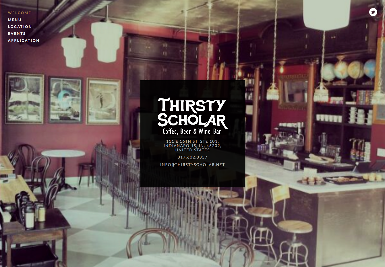
The website shows off one of the venue’s best assets: the décor. Stepping into the Thirsty Scholar feels like going back in time, or into hipster heaven depending on your preference.
The website is stupid simple (not necessarily a bad thing), and I’m kind of disappointed the menu is a PDF which makes for awkward pinching and grabbing and scrolling on mobile. For a venue that put so much importance and effort into their aesthetic, I wish it would have translated more to their website.
Rating:

A little more information and personality wouldn’t hurt.
Bee Coffee Roasters
Fortunately or unfortunately, I’m biased towards Bee Coffee because 1.) they make seriously kick butt coffee, and 2.) they were willing to transform themselves into Luke’s Diner for a day which made all my dreams come true and for which I will be forever grateful.
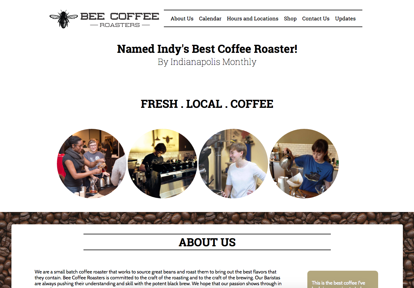
I like that they put their accolades front and center, though the slow-scroll reveal is a little much. However, between the award and images of the roasters “Fresh. Local. Coffee” gets lost, and would probably serve more purpose if it were a different color or a bit larger. Images of the baristas make it personal, and the few I’ve met are certainly an asset to their business. It’d be cool to have profiles of each of the featured baristas which would make it more familiar and add a level of trust before a customer ever set foot in the shop.
The “about us” section could use a little design love with some type hierarchy, but given it’s an older site I won’t knock off too many points. As I mentioned before though, not having a menu is an egregious misstep.
Rating:

A little design love would help Bee stand out as the outstanding roasters they are.
Milktooth
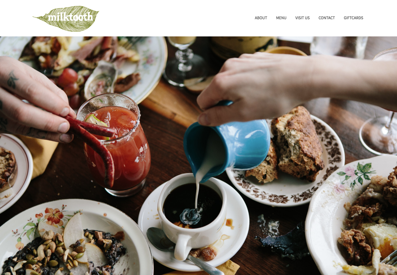
Milktooth, you sold me on the absolutely stunning photography. Full-stop. Thank you for making the necessary investment in a photographer and splattering that goodness all over the place. I wish I had a little more time to revel in the shots before being jolted by the slider, but I’ll take what I can get.
The overall execution is refined to accent the photos, and the grid is consistent. Very consistent. Like someone just piled legos on top of one another. It works, and while as a designer I yearn for something a little more interesting, the website’s clear purpose is to lure you in with the photos, which from my perspective is entirely successful.
Rating:

Pretty and functional.
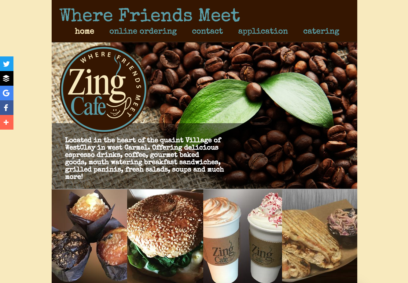
Zing Cafe
I have such mixed emotions about this website, stemming predominantly from the music that plays on load and without permission. For those of us who spend a lot of time on the Internet, this immediately incites a fight or flight response.
But wait. It’s not generic background music. Zing has a bona-fide jingle that pleasantly regales you with why they’re special, and given they went to that much effort I’m inclined to believe them. Never change.
Zing Café makes excellent use of a grid layout but keeps it interesting with a warm, limited and consistent color palette. It’s great they show their offerings from the outset so you know what to expect. One super important thing they’re missing is an obvious menu button, which for any place serving food is the main point of the website. Overall, the charm makes up for the wonky user experience.
Rating:

That’ll do.
Think I was really off-base or missed your favorite coffee shop? Leave a comment below and let me know.
Roundpeg is an Indianapolis web design firm.

