When you go to a website with the hope of finding something to do this weekend, there is there’s nothing more frustrating than landing on an outdated, crusty old event calendar. A good calendar should feature upcoming events designed for quick scans and easy searches, but all too often websites miss the mark.
Business owners and organizations with events take note. If your event page fits any of the descriptions below, you’re driving people away from your site and maybe away from your events as well.To help you improve your event listing here are some of the most common mistakes, suggestions for improvement and a closer look at calendars I think get it right.
Empty Website Event Calendars
If you have an event tab or calendar page on your website I expect to find something on it. Your empty calendar takes up valuable space on your navigation and makes visitors feel like your site isn’t up to date. Easy solution here: remove the calendar or events from your navigation. You can always add it back later. Use the space in the sidebar or footers to link to other current information until you have events to feature.
Another solution, if you’re willing to take on the commitment, is to keep it updated. Isn’t that why you added the calendar to begin with?
If you don’t have time to dedicate to updating a calendar on your site, instead use social media to spread news of events. The benefit of this approach is the wider reach that social media will provide. The downside is the fact that your target audience won’t be building a habit of visiting your website.
Doing it Right: The Rathskellar
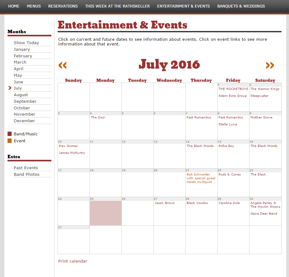
Admittedly not the most aesthetically pleasing, the Rathskellar’s calendar lists enough events to make it worthwhile. With a few new events each week, the calendar validates the Rathskellar as a place with regular events, updated frequently. The month at a glance allows visitors to plan several weeks in advance

Difficult to Read
Keep in mind that an event calendar needs to be legible. We all appreciate a nice photo of an event, but it shouldn’t interfere with the information people are looking to find. Prioritize the information and make sure people can find the important things: date, location and time. If any of this key information is missing or difficult to find, people have already lost interest.
Missing the Basics
Speaking of important information, every calendar should have the basics. If you don’t have the basics, take it down. You want people to come to your event, don’t leave them with any questions; the event location, time and a brief description are the bare-minimum details. Don’t go overboard, but the more you include the more comfortable people will be with showing up. No one wants to walk into a situation they know nothing about. If you have the space, consider including additional information like cost, a more detailed description of the event, a schedule or a map.
Doing it Right: Hifi
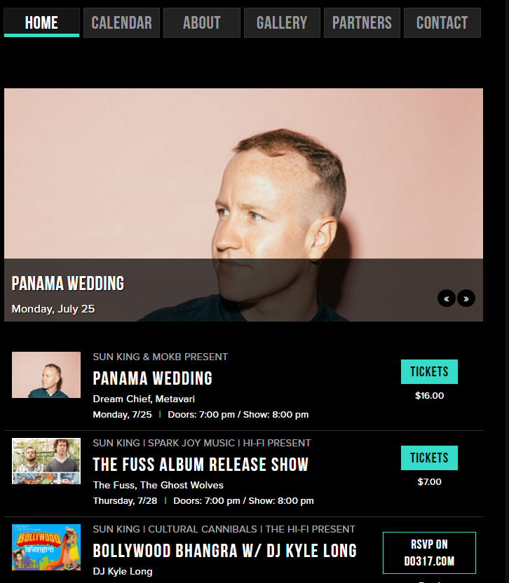
The events are clearly organized and easy to read. All of the information is organized thoughtfully with a clean simple design. Sponsors, name of artist, time, date and cost are all listed clearly. This site is a particularly good example because it includes visual interest without cluttering the page. Organized in both list and calendar format, this site makes it easy to quickly scroll through events.

Clickable Without Content
Clickable links give the impression that there’s more content to come. I get really bummed out when links are clickable and I end up on an empty page with nothing else to read. When creating a schedule or event calendar, it never hurts to include a second level of detail to let your audience know what it’s all about and hopefully persuade them to attend. If tickets are necessary, make sure you give the link with instructions for purchase.
Doing it Right: Indianapolis Children’s Museum
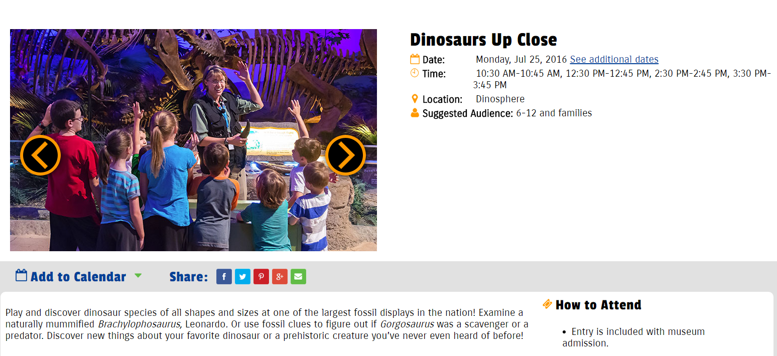
The Indianapolis Children’s Museum usually has multiple events or special programs going on at once. A secondary event information page is necessary to list all of the event times and details. Secondary pages for each event keeps the monthly calendar clean and simple without sacrificing important details.

Non-Mobile Responsive
Most people look for events and schedules on the go. A mobile responsive event site is essential. Simple design and clear content are the keys to a user-friendly experience for mobile audiences. This aspect is really one of the most important things to remember when including a calendar on your site. Trying to zoom and scroll on a mobile device is not easy to do and is the epitome of bad user experience.
To summarize, if you can’t keep up with your events calendar, you don’t need to have one. Yes, they are a great resource to drive traffic back to your site and establish it as the place to go for information, but a poorly maintained calendar sends the opposite message.
What message are you sending to your visitors? Do they hate your website? Take our web audit to find out.
Roundpeg is an Indianapolis web design firm.

