When I feel a little stale, creatively, I choose a web design theme and write a list of words related to that theme. Then I Google those words and look at some of the websites in the search results. Some are really terrible. And some use cool design ideas and fun choices I’d never think of on my own.
For this post I wanted to share the results of some of my searching around the theme of everyone’s favorite season: summer. I know we’re past the half-way point already, no point complaining. But it’s summer in my heart forever, so let’s go ahead and make that list!
A Few of My Favorite Summer Things:
hot dogs
sunscreen
beaches
The O.C.
Summer Olympics
camping
state fairs
popsicles
sprinklers and pools
iced tea
Lollapalooza
baseball
Super neat, right? While Googling these search terms I found some stinkers for sure (looking at you Wham-O), but I’ve excluded those for now. We can learn from people’s mistakes but I prefer to focus on the positive aspects of these web designs. Let’s start with my super-fav!
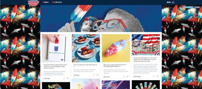
BOOM goes the freezer pop! This is the brand site for the icy summertime treat made by Wells. It’s really just their Tumblr profile page but they’ve customized it with a branded domain and some dope memes.
Lesson: pay attention to your audience; identify your strategic goals. If your audience is kids and you want to introduce them to your product, why not cater to their zero-second attention span with quick laughs and relentless repetition of your brand name and picture? Makes good web design sense to me.
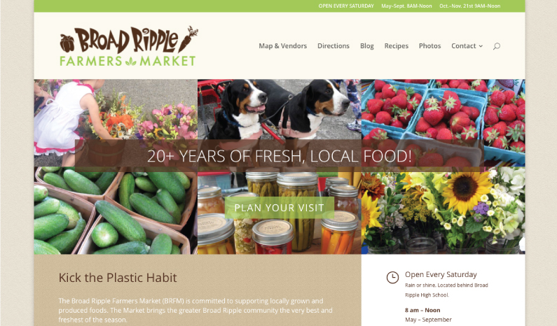
Phew. Just one website in and I need a break from all the flavor explosions in Bombpop-land. Guess what? NO BREAK! Strawberries at the Broad Ripple Farmers Market be like-whoa with flavor. Cute dogs all sniffing on the fruits. And flowers just everywhere.
You truly have to be there to experience the bounteous joy springing from stall after stall of fresh, local food. But this web design does a great job starting with a photo grid of amazing sights, complemented by earthy design elements to reflect the market’s hip, local-focused vibe.
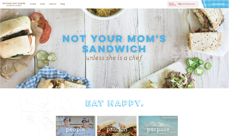
While we’re on the topic of freshness, let me mention the web design for Mendocino Farms. This Californian sandwich shop cashes in on our lust for summer picnic foods. Kind of a cross between a California tech startup look and JoJo’s “Fixer Upper” aesthetic.
As always, photography is the key. Before visiting any restaurant, I want to see the food. Mendocino Farms delivers the pics I’m looking for. Notably, they don’t picture every single menu item. No need. I’m sold on the whole menu just looking at the sandwiches featured on their homepage.
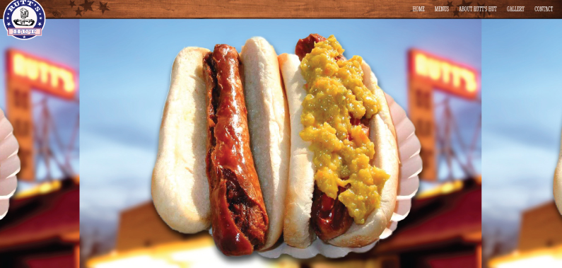
Do you know about rippers? 4 words: deep fried hot dog. This intense cooking process causes the hot dog casing to burst and transforms this classic American meat product from one degree of glory to another delicious degree of better-pack-some-Tums magnificence.
Rutt’s Hutt follows the same killer web design advice to sell its rippers: show me the food. These hot dogs are horribly mutilated, but I can’t look away. In fact, I’m actively salivating just writing about it. So delicious.
Also: the red, white and blue theme is very Fourth of July, pitching this web design right down the center of summer.
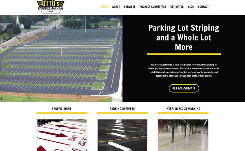
That searing, acrid smell you smell? That’s not the deep fried hot dogs. It’s fresh asphalt going down to repair parking lots ravaged by winter’s freezing temps. Otto’s Parking Marking trusted Roundpeg for a web design as bold as the stripes they paint on parking lots across the nation all summer long.
This site is lucky to have a few key images that quickly communicate the benefit of working with Otto’s. The main homepage image tells me they can handle a really big job. The three blurb images illustrate the three main service areas quickly and clearly.
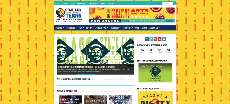
The biggest state fair in the country is Texas. Was it ever a question? While the State Fair of Texas extends late into October, I imagine the temperature in Dallas stays plenty warm for enjoying all the summertime fun to be had at the fair. Just look at the corndog wallpaper!
This website convinces no-one to attend the fair. No need. Billboards, ads and other marketing do that. But it gives ticket holders a base of robust information, displayed in a familiar fashion.
Which is great, because I don’t want to spend my time ogling a pretty web design. I’d rather be cruising the fairgrounds with a pair of corndogs, one in each hand. #honesty
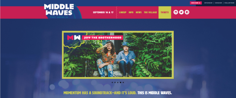
The Midwest is full of summer music festivals, new and old. And I’m a big music fan. But it’s a struggle to find them in Indiana. Middle Waves aims to change that. The slick branding in their web design is well done, despite the unpleasant color palette.
But there’s something about those colors that actually makes it summery. Blues and purples, pukey green, straw-ber-ita pink. With a name like Middle Waves, it’s like Jefferson Airplane opened a psychedelic splashin’ safari. Who wouldn’t want to chill out, rock out and expand their mind for $35 a day?
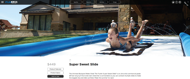
Next up on the HOT list? The cool, cool web design for product literally named “Super Sweet Slide”. I originally Googled slip ’n slide and came up with the OG Wham-O product. But their site was junky so I went with this $450 upgrade.
What makes this one scream summer? Check out the quality photography in the slider. I didn’t read a thing and I had a good sense of the product’s size, features and the main benefits. Just look at the girl’s face in picture four. Your face could be making that same face, if only you had a Super Sweet Slide.
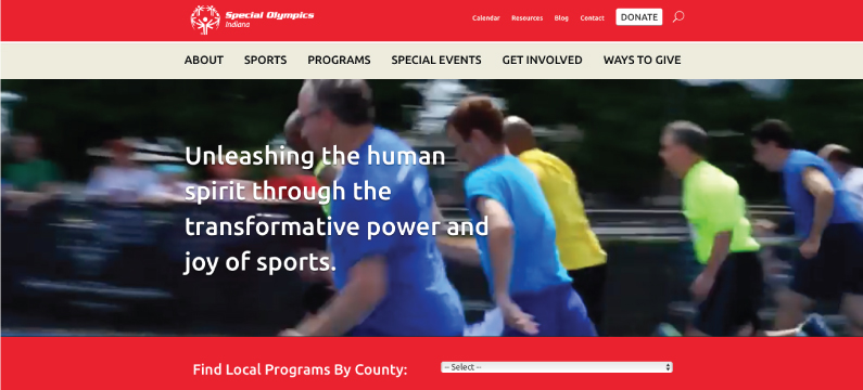
Slipping and sliding is just one way to get your summertime game on. But there’s so many other ways to get out and get active. The Special Olympics Summer Games bring the whole community together to encourage and celebrate the achievements of the athletes.
What I love about their homepage is the background video showing off real area athletes swimming, lifting, running track and doing other sports. It’s a truly dynamic complement to the powerful headline text.
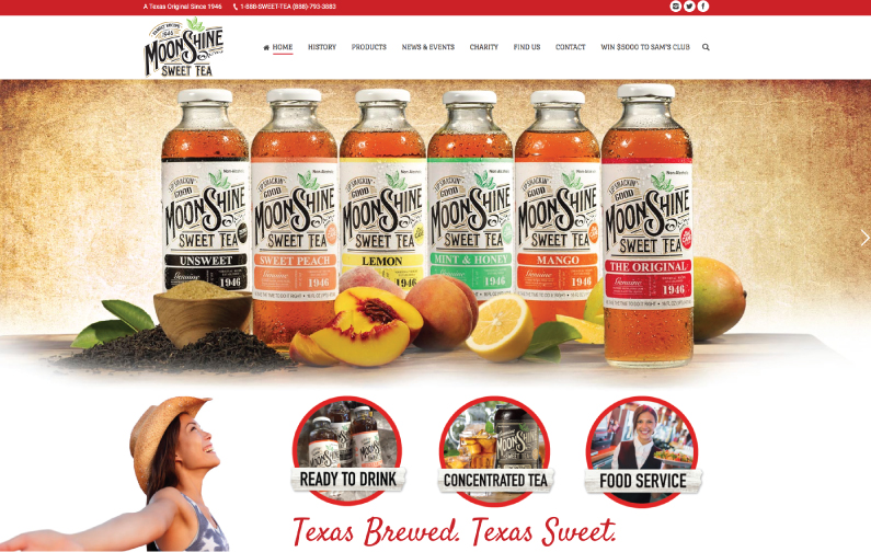
I personally blame McDonald’s for hooking us all on $1 any-size sweet tea (large, please!). In the past few years, the market for sugary teas exploded into a thousand brands and flavor variations, including Moonshine Sweet Tea.
Web Design Tasting Notes: Earthy and kind of hipster. Yet surprisingly crisp and modern, with plentiful bursts of white space! I’m intrigued. This design employs a ton of great elements: grid-based design, sparing use of parallax, careful typography, subtle animation, quality product shots. Hand this team a blue ribbon!
Summer may be halfway over, but these web designs keep the spirit alive. Just browsing this list ignited a few new ideas for new designs and things I’d like to try. Did you see anything you really liked? What about designs you disliked? Let me know in the comments.
Roundpeg is an Indianapolis web design firm.
