Everyone loves a good whodunit. Rather than investing years of your life writing a book or setting up an elaborate prank, you can treat your website like your own Clue board. *spoiler alert: you did it, and your viewer is the hapless victim.
I’ll save you the stock photo search for butterfly nets and booby-traps: a great way to see if your website is poised for optimal potential is to set up A/B or split testing. In this type of test you create two different versions of a page then see which one is more successful encouraging visitors to respond to your calls to action (CTA), sign up for your newsletter, purchase product or whatever your main goal happens to be.
Here are a few tricks and best practices to create your own A/B test. Kindly sidestep the quick sand to your left, if you don’t mind.
Laying the Boundaries
The booby trap is getting your visitor to have an intended, specific response. How do you know whether something’s working well? You can test it. Before you plot the trail, be cognizant of how many results you need/how long you need to run the test. A thousand results is a nice, round number with enough of a difference to determine a winner or loser. If your website doesn’t garner as much traffic, pick a percentage that gives your results meaning. When was the last time you made a substantial bet you were 60% sure of? Eighty percent is better, but 90-95% is an obvious prizewinner. A less than overwhelming preference for one or the other option indicates you may need to try something else.
Also, make sure your trial is long enough. Suppose a new recipe layout shows as the clear champion…after three days. You happily switch the design, lace your fingers behind your head and put your feet on the desk, watching those clicks roll on in. Until next week, when the results are the same or worse before your test. What happened? Your new layout only showed results for the weekend, when mom was scrolling through the interwebs looking for something fun to make. Weekday mom doesn’t have time to scroll, much less notice your design, so your results are skewed. Make sure your test runs long enough to account for anomalies caused by timing (the very least a week, if not a few).
Pick the Bait
Once you’ve set the boundaries for your trap there’s a whole host of ways you can manipulate your website. As you do be sure to keep your user in mind. Why are they visiting your site? What kind of mood are they in when they do? What do they want to get out of it? Here are a few places to get started.
Test Headlines and Hero Images
There’s a simple way to test whether your home page is doing its job. Have a friend open up the page and look at it for five seconds, then close it. If they can’t tell you what your website is for/what your service is/what your product is, then you need to switch things up. The purpose of your home page is to communicate clearly and incite excitement. Try different headlines to see what makes the most sense to your users, as well as which images hold their attention.
Long form vs. short form landing pages
If you’re not sure what your user is coming to your page for (tsk, tsk) then test the amount of content/bait they’re able to ingest. A general rule of the internet is brief is best, unless your content is interesting. Do your viewers need more information before handing you the keys to their inbox, or do they want to move on already, you’re taking up time? Find out.
Design/Color Psychology
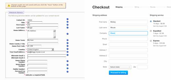
This is the split test you’re familiar with: should I make the button red or green? Design and color theory go so much deeper. You’re trying to build trust with your viewer. Case in point: of the two forms below, which one would you be more inclined to trust with your credit card number?

The details are important as well. Sometimes it really does matter whether your button is green or red, though probably not as much if it’s buried at the bottom of the page. Discovering which designs resonate with viewers improves your credibility.
Context of Call to Action
This applies to communication and continuity, much like your home page images and headers. Does the contact form make more sense on your product or about page? Should the CTA be at the top, side or bottom? Recently I designed a landing page where the primary objective was getting a visitor to complete the contact form. To improve search position there was a significant amount of content to contend with. Typically long blocks of text are placed to the left of forms so they’re read first. On this page, the form was getting lost in the weeds of content. It seems so obvious, but moving the form to the left gave it the needed prominence for more effective conversion.
Create Your Own Split Test
Now that you have a couple ideas, go and see which booby-traps your viewers fall for. A word of caution, don’t try too many at once. To loyal visitors, it will seem as if your website is changing all the time. That’s the quickest way to lose trust. Also, if you change too many things at once you’ll never know if it was Professor Plum, in the library, with the CTA.
Want a couple fresh ideas for your web design in general? Give us a call.
Roundpeg is an Indianapolis web design firm.

