Go ahead. Say it. Branding is a stupid buzzword designers use to get the $$$ from unwitting customers. But not you. You’ve dealt with enough customer service reps to know when you’re being duped. You’d just like the basic package, please and thank you and stop wasting my time.
If this is how you approach your website, marketing and other brand assets you are missing out on an essential way to communicate value to your customers on a subliminal level. Branding is what tells your customer “we’re great at what we do and you’ll have an exceptional experience with us” before they read your copy.
We had a fantastic opportunity to show off our own branding efforts with the new Roundpeg web design, a lot of thought was given to refreshing our brand and reorganizing our content. Here are a few things to keep in mind when your own brand needs an update.
Do everything with intention, and use it everywhere consistently.
Much like a website, when updating your brand you should know why it needs to be updated in the first place. Websites are a little easier since “it’s old/doesn’t work the way we want it to” is more than sufficient to proceed. Branding can be tricky since logos need to stick around long enough for your customers to become familiar with them. Same goes for colors. What else is there to update?
Fonts
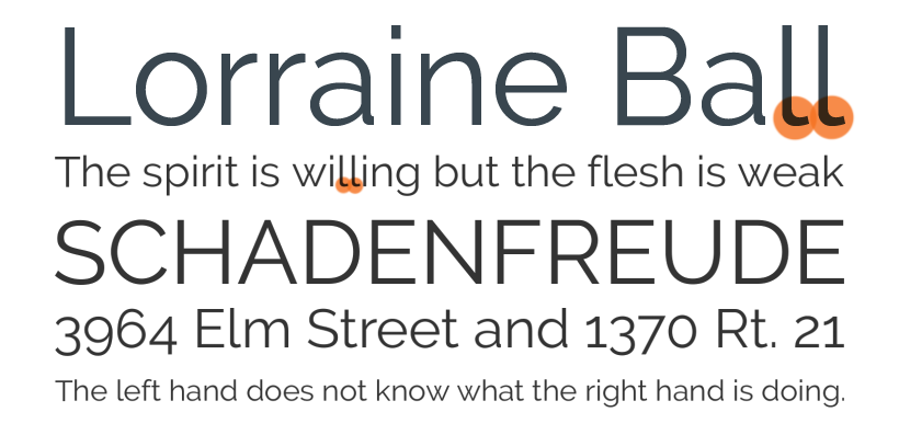
One major change we made with the website is our choice of font. While this should be changed almost as sparingly as a logo, we wanted to show that Roundpeg is growing up. Our previous font, Raleway, was clean with a little bit of spunk, and most importantly had a curled terminal on the “l” so “Lorraine Ball” doesn’t read like a bunch of vertical lines.

As much as we loved Raleway, we outgrew it. Those same terminals made large bodies of text difficult to read. When typing, the numbers had optical baselines (see above, where the numbers look like they’re jumping up and down) which we typically just reset to be on the same level. And after a while, the crossed lines in the “w” were a little much.
For the new web design we chose Proxima Nova for its clean legibility. In fact, a large reason it was chosen was because we enjoy reading blogs set in that font. It also has a large variety of weights and settings to play with and use for a variety of needs. It’s modern and professional without Futura’s sharp edges or Helvetica’s recognizable ubiquity. Most importantly, it works well for Roundpeg because it clearly communicates our professionalism while still being approachable. And we don’t have to fix the numbers by hand anymore.

Consistent Color Usage
Blue and teal have been The Peg’s core colors since its inception, orange was added a few years ago for contrast. In our new design, we put those colors to work. The dark blue adds distinction to headlines and titles and teal banners indicate when a user is viewing our resources. Bright orange commands attention for all of our calls to action.
Just as importantly, we chose where not to use color. Roundpeg is clean and professional which in design terms means a lot of white space. Whenever we needed to break up content, we used light grey and saved dark backgrounds for times when we want to request something of the user.
Imagery
Imagery was a point of contention during the Roundpeg redesign. We pride ourselves on focusing on what we provide for our customers rather than our “culture,” so we keep the cat pictures on Twitter, but no one wants to look at a website stuffed with paragraphs of copy so we had to find a balance.
For this new site, we created our own patterns and graphics.
The patterns provide variety without distraction. The hexagons also provide a visual for the metaphor in our name, literally a round peg.
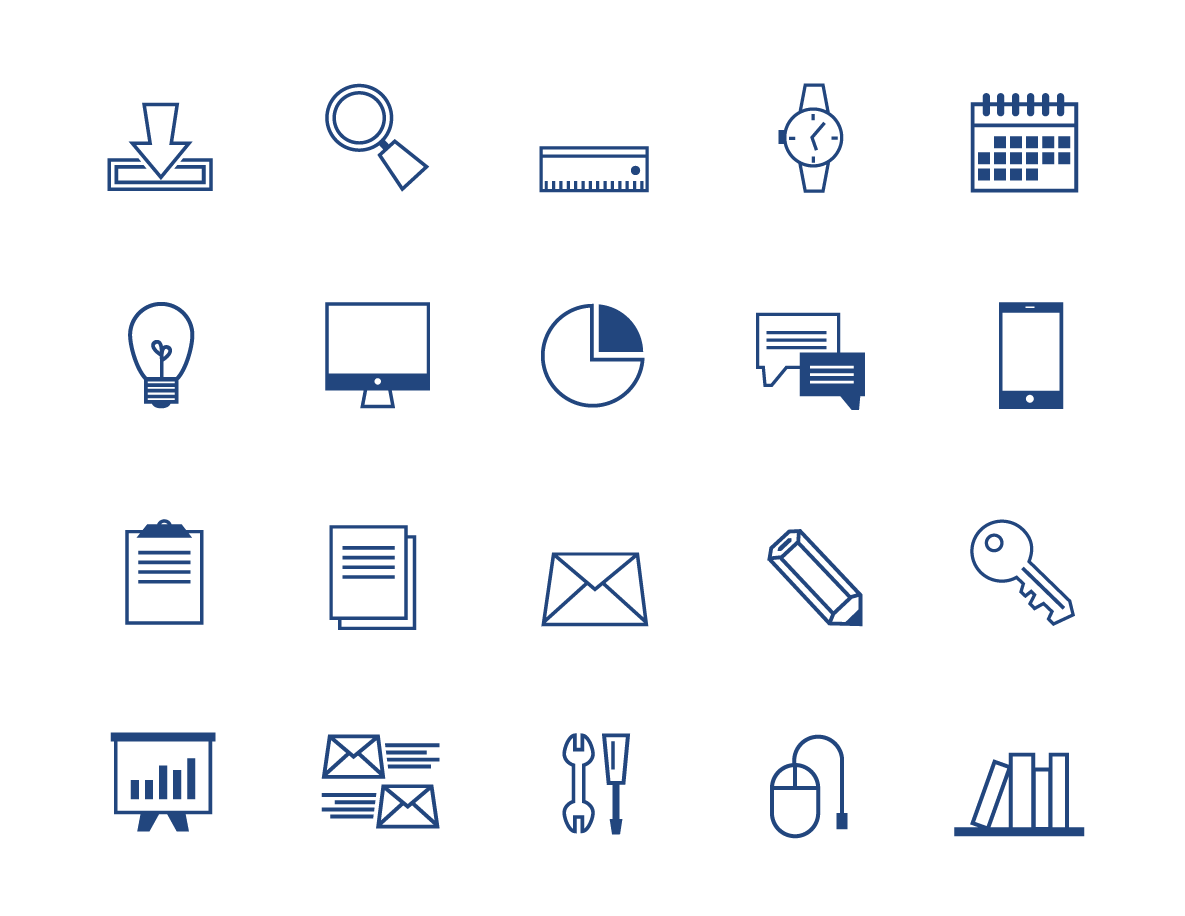
Each icon is unique to us, represents some part of our services and gives a distinctive feel to the site. Look for these icons to appear in other social media graphics in the months ahead. 
Together, these elements tell our story with and without words. We’d love to bring this same focus to your web design project.
Did you miss Web Redesign Part One? Read it now:
Roundpeg is an Indianapolis web design firm.
