This song is required listening while reading this blog.
I like sports – they’re fun to watch and a nice excuse to eat junk food and drink beer. I also like looking at sports team websites, which when done badly can also be an excuse to drink beer. But more importantly, sports teams’ websites have to do a little bit of everything: they promote events, sell merchandise, build awareness and lots of other little things you may not realize. Living in Indiana, I’ve grown up with a chip on my shoulder for at least one team I hold near and dear (which I won’t name for fear of boos). Thankfully, almost every big sports name in Indiana does a great job with their web design – and since they have to do so much, there’s a lot that we can learn from their choices. Let’s take a look at some of them.
The Indianapolis Colts
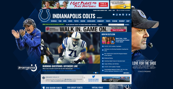
The Colts website at the time of writing (mid-April) is the one black sheep of this list in that it’s the only one that is completely in the off-season. As such, it really only has one primary job: build interest and excitement for the upcoming 2016 NFL season. It does so with its main call to action: a “read more” on team analyses from sportswriters (“Burning Question: Offensive Line”). Elsewhere on the page you see a wealth of secondary CTA’s: 2016 ticket information (which will likely claim a bigger space on the homepage as the season gets closer) and tons of offseason content including player interviews, cheerleader audition information and replays from the past season.
What we can learn: Your site’s calls to action will (and should) change over time.
The Indiana Pacers
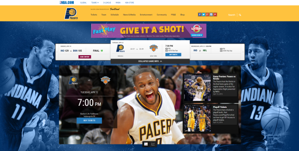
You can’t think of Indiana sports without the Pacers. Though eclipsed in popularity in the past decade by the Colts, the Pacers are Indiana’s team, just like basketball is Indiana’s game. The first thing you probably notice (apart from C.J. Miles’ gigantic grin) is the 3 game schedule at the top of the page along with the Pacers next tip-off time right next to Miles’ face. With just those two aspects of their homepage, the website answers the primary questions a visitor would have: when is the next game, and where can I get tickets? The Pacers site is exemplary in knowing exactly what prospective customers want, and giving it to them immediately.
What we can learn: Anticipate your audience’s needs, and meet them before they ask.
Purdue University Athletics
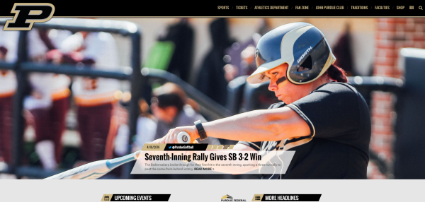
Now before I get a bunch of angry comments, the reason I’m choosing to highlight the Purdue Athletics website over the Indiana/Notre Dame/Butler websites isn’t just because I’m a Purdue alumnus and think that Purdue is superior to all those schools in every way imaginable, but rather because Purdue’s is the most significantly different from the others visually, and thus can give us a different perspective on the web design front. Immediately on the front page, at least half of your screen is taken up by an action shot of a student-athlete in action. Because college athletics are not primarily about making ticket sales (and because the money-making sports are done for the season), the main calls to action are to build awareness of goings-on in Purdue athletics. Still, the huge crisp action shots that immediately greet the visitor grabs attention and creates excitement, and for alums, instills a sense of pride.
What we can learn: Pictures are everything.
Kokomo Jackrabbits
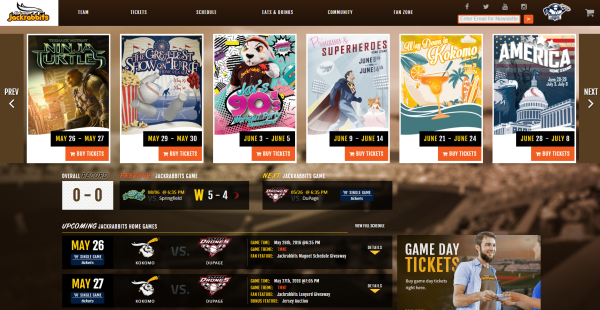
To answer your first question: Kokomo is a small town about an hour north of Indianapolis. To answer your second question: no, I do not know why a town of 40,000 people decided it needed a baseball team. As tickled as I was that my hometown had a baseball team, I was doubly tickled to see the website. The first thing you’ll notice is the scroll bar of special game day events at the top of the page. If I hadn’t told you, you probably couldn’t even tell that this site was for a baseball team. The lack of any immediately recognizable ballpark images along with the massive parade of special events to lure people in make this site seem somewhat desperate as if crying out “Please come to these games, we need to pay off this stadium we funded short-sightedly.” Oh wait, did I mention that not all these websites are good? This one is not good. Special shout-out to one of the worst neckbeards I’ve seen on a professional website (bottom left of the image).
What we can learn: Don’t look desperate, and up your beard game.
So whether your goal is to drive sales from your website, increase awareness and excitement for your brand, or desperately beg for attention, sports organization websites can teach designers a lot. Unsure of how to implement those lessons on your own website? No worries: take a look at some of our web design resources on the new and improved Roundpeg website and move from theory to action.
Roundpeg is an Indianapolis web design firm.


