We’ve been using email marketing since I was first introduced to Constant Contact in 2002. Over the years our email marketing program has changed and grown.
In the early days we sent one email a month to a list of a few hundred names. Our current list of active contacts exceeds 8,500 and is divided into different sub groups by interest and their relationship to Roundpeg. On average we have been sending between 20 and 25 targeted campaigns a month.
In the last few years our results have been all over the map. Campaigns sent to small niche audiences saw open rates of 30% or higher. This is well above the 20% rate which is typical for our industry.
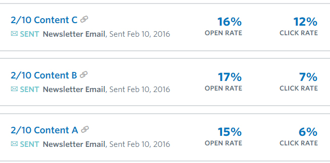
On the other hand the results for our primary campaign, the weekly newsletter sent to about 6,500 people, were disappointing. Of the 6,500 people, only about 15% were actually opening the emails and our clicks hovered around 8%.
We could do better
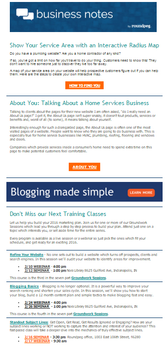
We had gotten comfortable with our newsletter design. With the exception of an update in our header about six months ago the layout had been essentially the same for several years. To encourage more engagement we decided to shake up the design. But how?
The first thing we did was start collecting newsletters from lots of marketing companies. One thing we noticed was a shift away from multiple articles to a single unified message. The idea was interesting, but I wondered if fewer articles would result in fewer clicks?
In addition to looking at the content, we also looked at the designs. Leisha liked the very clean one topic layouts. I loved the use of really big images under the subject line. Taylor had an idea to use two smaller images side by side. We decided to test several designs: some with large graphics, some with smaller graphics and others with just text.

The Email Marketing Tests

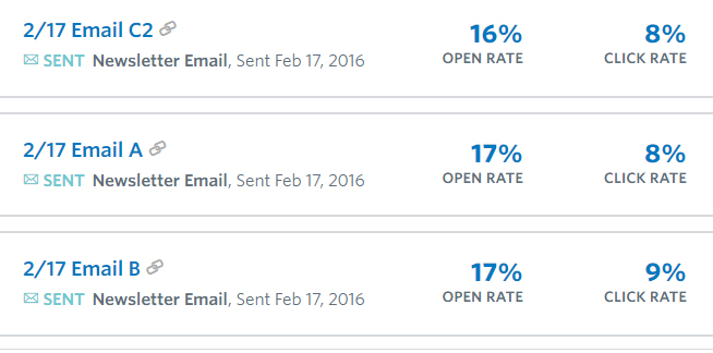
I almost cancelled the test thinking we had a clear answer, but since we had already designed the campaigns we decided to continue the test. Much to our surprise in subsequent weeks the results flattened out with very different layouts performing about the same.

Form vs Substance
Less is More
We did notice our interaction didn’t really change as we added or took away links and calls to action. Giving our readers one choice was as effective as two, three or more.
The New Look ( For Now)
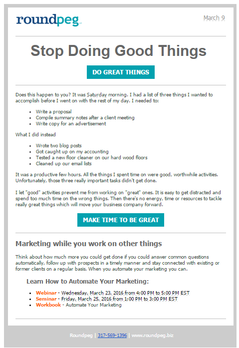
So after weeks of testing our email newsletter has a new, simpler look featuring only one article. There are fewer calls to action and all the marketing tools are related to one core topic. The clean design will be easier to read on mobile devices and easier for us to design so we can spend more of our time focused on the content.

Want to keep up with email adventures? Sign up for our weekly newsletter today.
FREE Business Advice Delivered to Your Desktop.
