The trouble with websites today is the temperature. They’re cold. All the chilly white space. What if your business is known for its warm, home-grown character? What if your products are made by hand? How do you convey that when many web design trends and themes are flat, all-digital creations?
First thing? Take inspiration from the real world. Watch some of those interior design shows. Or maybe you already have brands and designers you like. Check out their websites and see how their design style translates online.
magnoliamarket.com – Chip and Joanna’s signature farmhouse chic is all the rage.
sarahrichardsondesign.com – Sarah Richardson mashes the modern taste for clean and minimal with bold details.
andreaschumacherinteriors.com – This lady is like whoa with the patterns.
Before you ask, I have been watching too much HGTV. It’s January, why go outdoors or be productive when all these people are doing it for me?
Here’s a few takeaways from my trip around the homey (yet elegant) corners of the web.
Color Palette
Most walls are white for a reason. They’re background, a field for other elements to play on. But white isn’t just an empty vessel. It’s fresh, crisp and clean. Used in a large quantity with a subtle texture or embossing, you get dramatic effects. Or like in every classic Apple ad, contrast it with a single bold color or a rich photograph.
How cool are these assorted vases by Magnolia Market, craftily repainted in white? By themselves, neat. With those tulips? On-point.
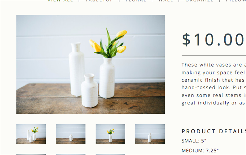
Web designers today strive to get out of the way and let the website contents shine out. Like the vases, the warmth and character comes from what’s inside, not the frame.
Want more options? Try a very light beige instead of white. Ya’ll know beige is the ish. Or flip the script and choose a chalkboard black like Pizza Hut.
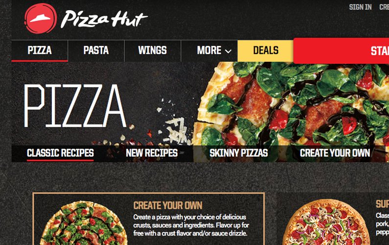
Same principles in play: minimal background, bold color and photographs. Yum.
Texture and Pattern
Color’s not the only player in this game. Flat, expansive fields of color alone may seem empty or cold. In the tulip picture above, I love the warmth and texture from the wood grain in the table.
On the web, subtle patterns like the samples below contribute quirkiness, character, even the illusion of real world objects like fabric and paper.

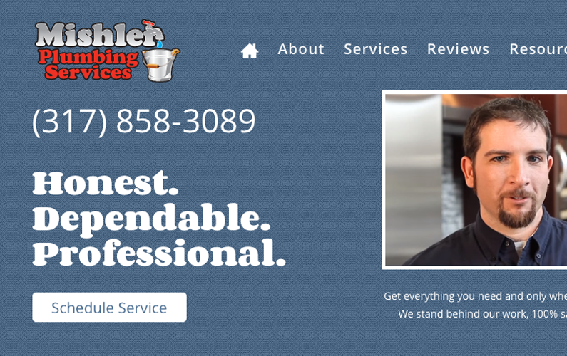
Those treats come from subtlepatterns.com and make great backgrounds. You can colorize them too! Check out Mishler Plumbing’s blue fabric background.
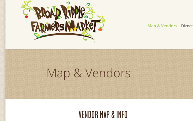
Want to make a bigger statement? Choose a broad, graphic design and use it in the background. I’m super into Broad Ripple Farmers Market’s swirling pattern behind the page titles.
Pictures
Use natural light to photograph people and products. No Instagram filter needed. Natural light looks much better than harsh fluorescent lights or other common lamps. And when you’re going for an authentic, handmade look you need to use what you have, like a window and a patch of sunshine.
Magnolia Market photographs all their products in carefully staged scenes that nonetheless appear natural. Like somebody just set down that cool basket and they’ll be back for it later.
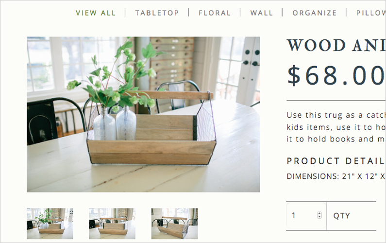
You know what else that picture looks like? Money. When your pics are actual snapshots from a broke-down PowerShot, it’s not cool. Work with (and PAY) a professional to stage and shoot product shots if you’re serious about selling.
Rubschlager Breads started their new website project with several photo shoots under their belt. I spent the whole time developing this site wishing I had a massive sandwich.
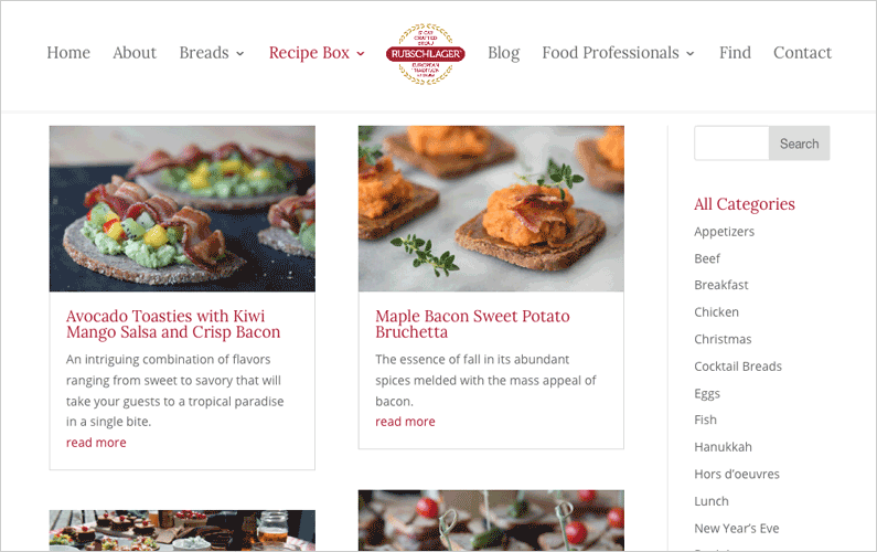
Whether you’re in the studio or shooting on premises, quality photography makes a huge difference. And having a library of image options and variations actually makes web design go faster and funner!
Polish
You’re wondering what really gives a website that true cred? That kind you only get from hours crafting in a barn? Let’s wobble.
For your header fonts, choose a serif font with imperfections. Think of hand-lettered signs made by skilled craftsman. Look for a little wobble in the strokes, maybe even a hint of texture like rubber stamp or paint brush.
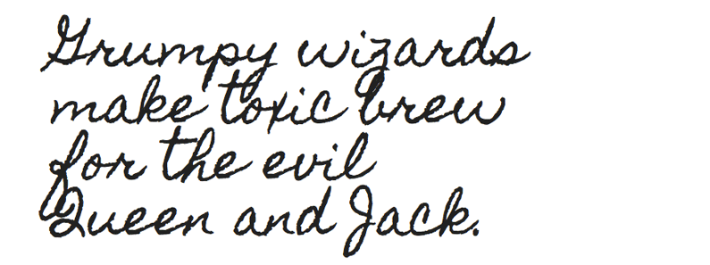
That’s Homemade Apple, a free Google Font anyone can use.
Consider pairing your decorative font with something straight-up and simple for the majority of your text. This makes for good contrast and readability. Try sans serif fonts like Open Sans or Roboto. Both of those are Google Fonts too.
Need an icon or illustration? What did I say about the wobble? Something drawn, painted or whittled by hand will maintain the one-of-a-kind look and feel founded by your logo, other branding and photograph choices. Just a drop of whimsy on these icons for Hoosier Doggy made a big difference. Just look at that moon!
![]()
Used sparingly, these details are the finishing touches that tune your site into perfect harmony with the established branding.
Many popular themes and design trends seem packaged for Silicon Valley. But if your style doesn’t run that way, don’t feel stuck. Work with a professional web designer to nail down your brand and express it with a customized website.

