Do you remember the days of Netscape Navigator and AOL Keywords? It was a scary time, when 56k modems roamed free and Flash extensions were but a twinkle in Adobe’s eye. “Dotcom” was a way to describe a new startup business, and websites were something that only the rich and tech-savviest played around with. Web design was in its infancy, and so most pages looked closer to something a second grader would bring home to hang on the fridge than what we see today.
It may be hard to believe, but there are websites from the 1990’s that are still live today. These are relics of the internet’s past, like fossils waiting to be discovered and researched. Perfectly preserved in all their MSPaint asset glory, business owners today can still learn a lot from both the successes and failures of these sites. Here are just a few that we’ve come across, and what we can take away from them.

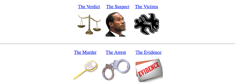
CNN’s O.J. Simpson Trial Page
“The Most Trusted Name in News” is as guilty as they come for web design sins. Immediately what comes to mind is a site like The Drudge Report with its solid white background and newsgroup-like layout. Sticking out are the awful image links: low-quality generic images, poorly cropped to boot. Scrolling down, the entire page is nearly identical with flush left links, sparse delineation of content categories making it easy to get lost in the list. A good portion of the links are dead, including image links, while others take the visitor to extremely brief news snippet that are usually covered more than once on the main page. The last kicker is the URL itself: www.cnn.com/us/oj/ – just 2 characters away from their main US news site. With such a short extension, it would be easy for a visitor to accidentally stumble upon this mess.
What We Learned: Use high-quality images and edit them with care; make sure all your links work; manage your vertical space for easy navigation; be mindful of your URL.

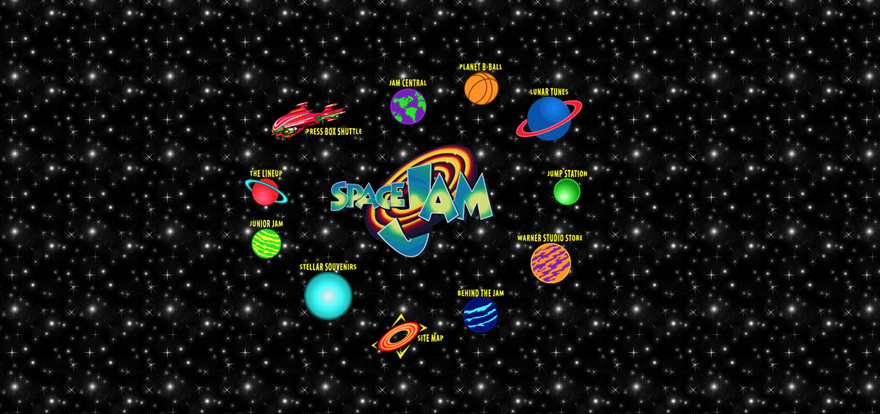
The Official Space Jam Site
Welcome to the jam of bad design. This assault on the eyes begins the minute you enter the site: a repeating low-quality image is the site background, clashing colors make everything difficult to discern, and small grainy text has you squinting from the get-go (this could be due to the fact that computer monitors have become vastly superior since then). The sitemap is also confusing; would you know what “Jam Central,” “Jump Station” and “Press Box Shuttle” referred to? Would you guess production notes, Warner Bros. studio links, and site news? Despite all its shortcomings, the Space Jam site does one very good thing – everything is contained in one screen, no scrolling required on the main page.
What We Learned: Make your site readable on all platforms; make sure your sitemap is easily navigable; be smart with colors

The Bob Dole/Jack Kemp 1996 Campaign Website
A politician with this site today wouldn’t make it past county zoning commission. That said, there are some bright spots to this website (which is ironically old enough to vote). The front page is easy to navigate and a first-time visitor would know exactly where to go to get what they want: Dole’s positions and agenda, volunteer opportunities, and where the team is on the campaign trail. The site also keeps a consistent color theme, though the color combination of red/white/blue should be expected from a political site.
The bad design elements present themselves with a little more digging. Some content exists in multiple places, sometimes incomplete in one area or another. The news section is less “news” and more a stump station, with prerecorded speeches and commercials. The crowning jewel of bad is the downloadable wallpaper, which are 128 square pixel BMP images, meant to be tiled to create a Frankenstein’s Monster background.
What We Learned: Manage your content locations, put your most sought-after content upfront; make your download offerings worthwhile
They say those who don’t learn from historically bad websites are doomed to repeat them. Though some of these old pratfalls are easy to avoid with newer technologies, others can trip up business owners looking to establish an online presence. Luckily, our designers at Roundpeg are history buffs, determined to never let those atrocities against good design see the light of day again. So if you think your site is a little too close to Space Jam, get in touch and we’ll be happy to bring your site to the 21st century.

