Working on a new web design? You might want to think about tone. Your web design’s tone influences how visitors think and feel about your company.
Do you want to be known for your friendly service? Fast delivery? Crisp appearance? Core brand elements, like the logo, fonts and brand colors should reflect these values to start with. Web design is one of the primary expressions of your brand. And it’s the main channel for establishing a tone that matches your values.
In creative terms, tone is the relative lightness or darkness of your site’s appearance. Combined with hue (you might call that color), tone unlocks a world of moods and emotions. I frequently talk about tone like temperature, warm and cool.
Cool tone is calm, secure and a little buttoned-up. A lot of financial services and medical web designs use blue and gray color schemes to build trust and ease tension.
Warm is welcoming, friendly, passionate, relaxed, even wild sometimes. The web designs below do warm the right way with thoughtful color schemes, good lighting and happy faces.
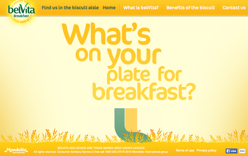
belVita (Australia)
belvitabreakfast.com.au
Found on spyrestudios.com
belVita is the kind of fiber-rich treat I expect grandmothers to carry in their purses. This site changed my mind about bringing it to breakfast. It gives the brand a warm, early morning feel. It’s friendly, inviting and just warm. Not hot. There’s no pressure or intensity. Which is just fine for breakfast.
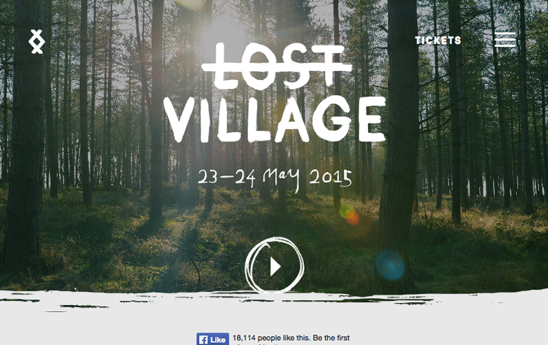
Lost Village
lostvillagefestival.com
Found on line25.com
Warmer weather means music festivals. While this UK music fest is too far for me to attend, I feel like I’m already there with this design. Dreamy photography of the festival grounds shows off the early spring green appropriate for the event’s timing. While the colors are muted, the design’s photographs immediately convey a misty, haunted-summer-camp vibe.
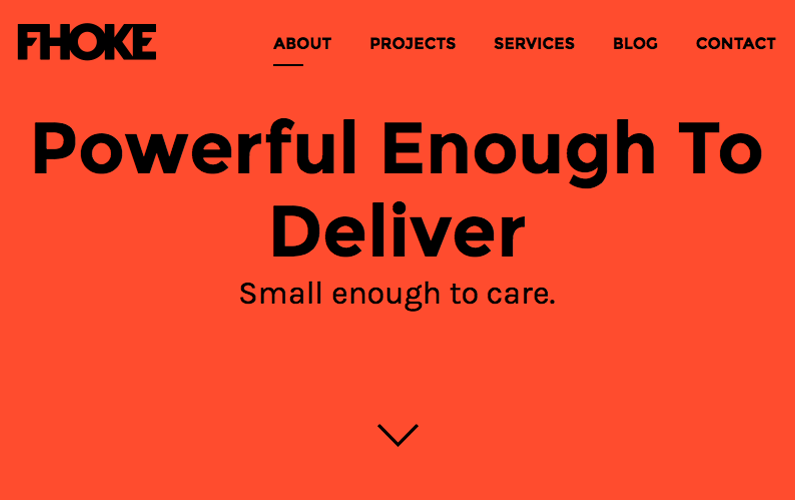
Fhoke
fhoke.com
Found on line25.com
Do you believe Fhoke? Their super-bold red color is rich and passionate without screaming in your face. It’s like hot sauce, the good stuff, not the crazy homemade stuff your cousin carries around in a flask. Fhoke picked a color that can’t be missed to match their bold value proposition.
Advanced OrthoPro

advancedorthopro.com
Web Design by Roundpeg
Does this site feel warm to you? The brand color isn’t hot-sauce red or sunshine yellow. It’s blue. Tone is anchored in your color scheme, it’s true. But your content also has a tone. Your text and photographs also help visitors know how to feel about you. Warmth radiates on every page of this site in the smiles of the doctors and patients and the casual, straightforward writing style.
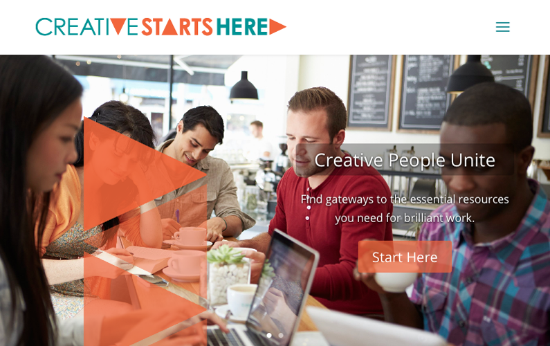
CreativeStartsHere
creativestartshere.com
Web Design by Roundpeg
CreativeStartsHere is a fun brand because it’s both cool and warm. Coral and teal come together for a balanced feel that’s warmed up by smiling faces. This is a fairly common stock photo, but it helps tell the story started by the words. The warm tone, with a dash of cool, builds the idea that CreativeStartsHere is smart, fun and committed to creativity.
The cool, crisp elements prove that warmth isn’t everything. Your brand might benefit more by lowering the temperature. But that’s another blog post.

