It’s a pretty obvious statement that a diverse group of people uses the web. As a designer, it’s an important part of my job to not only create something visually pleasing and functional, but also accessible to those with visual disabilities. Here are some basicweb design tips to incorporate into your web design to make your website more useful and accessible to your audience.
Contrast and the Visually Impaired
People with color blindness can have a hard time distinguishing between elements on your website. Since they don’t see a full range of colors they have trouble distinguishing where one element ends and another one begins on your website. Approximately 8% of men and .5% of women have some type of colorblindness–which if you think about it is kind of a lot. Fortunately, there are many resources to test and check the readability of your webpage.
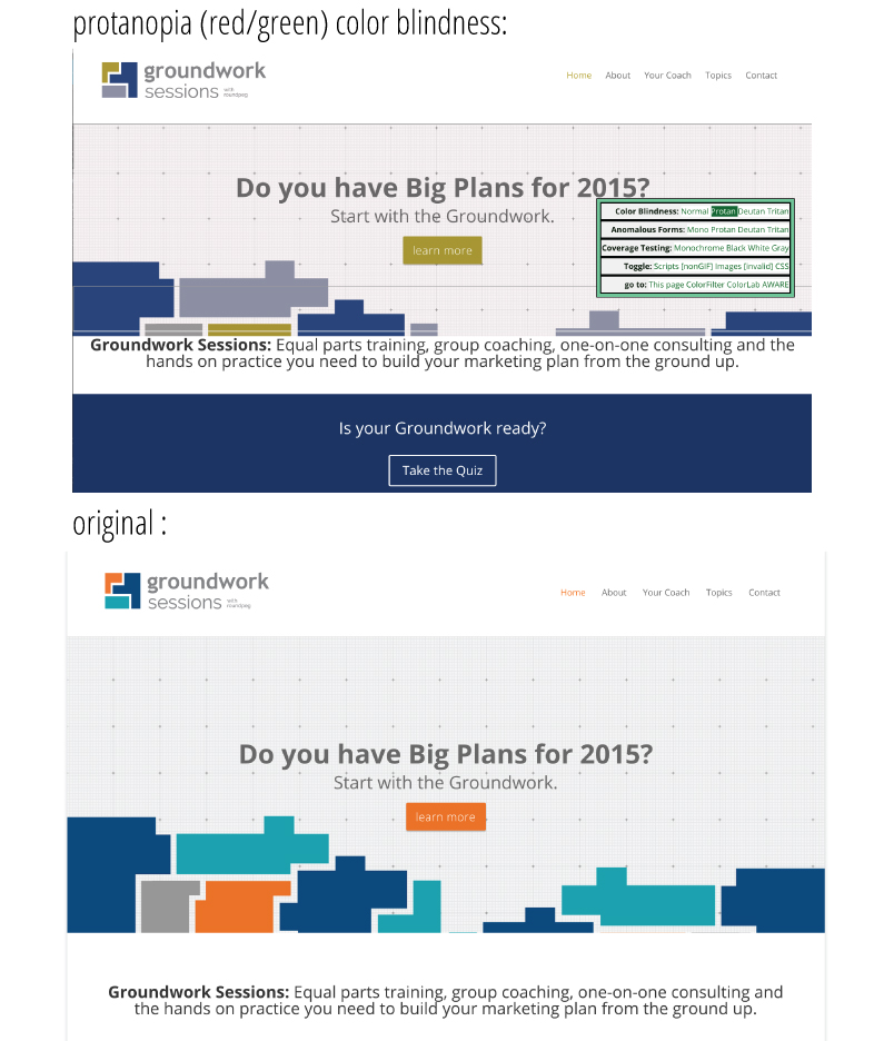
This colorblind web page filter will essentially filter your website for certain types of colorblindness. It’s eye opening to see how accessible some websites are to the visually impaired. For fun, I tested out one of the Roundpeg’s websites:

I only tested for one version of colorblindness, but you get the idea. This website can be a little slow so make sure to give it time if your website is larger!
There are also several good desktop apps to test for different types of colorblindness in real time. Sim Daltonism, an application for Mac, quickly lets you test how someone with colorblindness might actually see navigating to different pages, or even their desktop.
Practice good contrast anyways!
Even though someone with normal vision can see something, doesn’t mean they’re going to enjoy viewing it. So mastering the basics of contrast will improve every design.
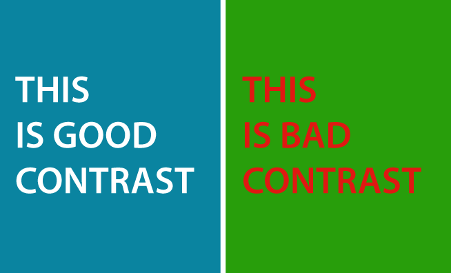
For example compare the two examples below. The blue/light grey combination has high contrast and is extremely easy to read. The version on the right is illegible for a person with red/green color blindness. And even for someone like me with relatively normal corrected vision, it’s still awful to read with all that vibration.

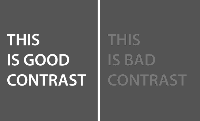
One easy way to test for good or bad contrast is to turn your design into grayscale. See what’I’m talking about? The light gray on blue works much better than the Christmas color scheme. Aside from being a terrible color scheme that doesn’t work well together, the contrast is extremely low making it really hard to read.

Title Your Photos for Blind Support
This one may not seem as obvious, but the web is used by many people who are completely blind. These people use tools to help them not only read the text, but also “see” the other elements of the page. They do this by reading the picture titles. For a long time, I didn’t realize this and would give photos nonsensical names like “girl.jpeg” or “banner-picture.jpg.” Understanding the needs of the community and planning for it, you can easily accommodate visually-impaired users who would greatly benefit from a logically titled photo.
Test your web design and learn more
Even though you may not know someone with color blindness, other people are a great resource when you’re testing out how easy or hard something is to read. Many times if your contrast is off people will be able to point it out. If you’re interested in other accessibility for web tips, be sure to visit the following websites:

