Simple logos are ok. But I’m not interested in logos on their own. Effective Internet marketing demands something more. Something like a system. And there’s nothing like a new web design to show where a branding system fails.
Working on web designs every day, I ask a ton of questions about branding. Do you have a one-color version of your logo? Is there product photography? Is it OK if I break up the logo like this? We need a third color, what others do you have? Many times, a design can’t move forward until some basic (or obtuse) branding issue gets resolved. I’ve broken down the most common needs below. See what you’ve got and what you’re missing.
Can We Get That in a Different Color?
A one-color logo translates all color into either white or black. It’s not the same as grayscale, where a computer picks the closest match. Grayscale tends to look dull and you’d never want that to represent your business on its own. A one-color logo may reposition or slightly redraw the logo if necessary so it’s completely understandable in just one shade of one color. You might also have a reversed version of your logo that maintains colors in the graphic or icon, but turns white text to black.
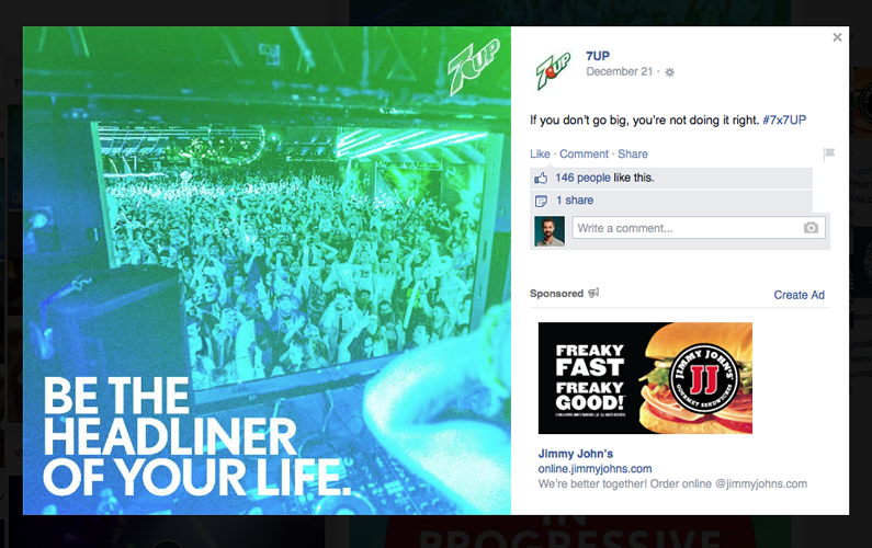
Web designers use one color logos or reversed logos on dark backgrounds or against photographs. In this Facebook post from 7UP, you can see the full color logo and the one-color right next to each other. Notice how the iconic red ball loses its shine and some gradients are carefully converted to strokes.

That background color might be defined ahead of time by a color palette. This is the collection of colors used in your branding. There may be one or two main colors, and any number of alternatives grouped in smaller palettes.
Web designers use your color palette to define backgrounds, font colors, a distinct hyperlink color and other structural parts of the web design.
Is There an Icon Version?
Logos combine nearly everything about a brand into a concise package. Colors, text and graphics are all rooted in the logo. But that doesn’t mean the work’s been done to express each of these elements fully outside of the logo.
For example, every website includes something called a favicon. This is the tiny picture that accompanies your website name in the browser tab, search history and list of bookmarks. The smallest this image appears is 16 by 16 pixels. And it’s always square. The only thing that is going to work in that space is an icon, a kind of visual shortcut for your brand.
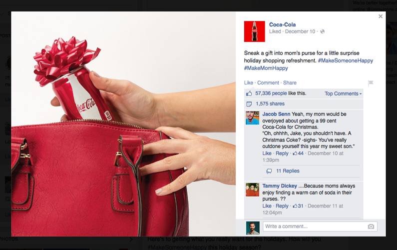
Visit Coca-Cola’s Facebook page and you’ll see their wordmark is augmented by an icon in the signature shape of their glass bottles. They use this any time the regular text won’t fit, which is a lot. A nice icon to go with your text instantly makes your brand more flexible.

If icons are great for representing your brand in tight spots, patterns are your tool for covering big spaces. You might repeat your icon to make a pattern, or choose another element in your logo that could be tiled. Web designers use patterns with background colors to fill areas that may expand and contract depending on the content and screen size. Mobile responsive design has accelerated adoption of this technique.
There’s another way your logo might need work to cope with mobile devices. Alternative lock-ups are logo variations that show different placements of words and icons. Your logo may not require all of the variations developed for Deviant Art’s new look, but logos with lots of text frequently need a few different versions. You’ll at least want a vertical stack and a long, horizontal version.
What’s The Font?
Fonts are overlooked in the rush to complete a logo. Not just the fonts used in the design itself, but the fonts that will appear with the logo. Nobody cares to define standard headline and body fonts and chaos reigns. So, brand fonts are defined and redefined over the years. Everyone from the receptionist to the latest in a string of marketing companies picks their favorites without caring what came before. This isn’t happiness.
Headline fonts are thick and bold. They’re used as headlines, headings, anything you want to make a big statement with. They don’t have to match the logo, but many brands do. The body font is used for reading material. It will not be decorative or exciting, but it will be easy to use and suitable for printing with large blocks of text. Body fonts on the Internet are almost always sans-serif, but headline fonts can be a little flashier. By defining these fonts before starting your website project, your web designer won’t have to guess which style you like.
We had the privilege of working with Home to Indy on a new branding package that included choosing new fonts. See how the medium, used for body copy on the business card, is lighter weight and sans serif. Regular and bold use a stylish slab serif for bigger impact.
Got Pictures?
I love to talk about pictures. Photographs make web pages pop. They tell stories instantly. And they give proof that your products and services are for real. With visual content and photographs such a dominant force in Internet marketing, your website’s bound to need a bunch of them. This is where a consistent photographic style contributes to the strength of your branding.
For now, let’s define style as the combination of tone, subject and composition. You’ll want to develop a list of tone words that describe your brand that could be applied to a photograph. Think “bright, cheery, summer” or “cool (temperature) and thoughtful” or even “dark, tense, sharp”. The “subject” has to do with what your pictures tend to contain. Are there lots of people? Mostly interior or exteriors? Examples of composition include close-up, wide shot, symmetrical and unbalanced.
By working consistently with the same photographer, you can establish a style your customers come to trust. Over time, you can build up examples and documentation of this style for others to follow.
There’s Always Something Else
Want even more goodness for your brand? Ask your marketing team about doing an icon set based on your logo. Icons are great for use in web design. Your web designer will inevitably produce a few anyway. This might be a good time to introduce a complete set of anywhere from 20 to 200 distinct icons that all go together.
Something your designer will also find helpful is a sheet of logo guidelines. If you’ve ever gone looking for the logo of a social network, you’ll be familiar with the logo guidelines they set out. These are intended to make sure your logo is always presented at its absolute best. Helpful for when a team of people is all working on your marketing and have questions about your preferred look.
Gaping holes in your brand are a major bummer. Especially when you need a web design or other communication in a rush. When there’s no time to take a longer look at these issues, designers have to make something up on the spot that can’t exactly match what came before. Guidelines for colors, fonts, logos and other visual components save time and effort for new designers interacting with your brand. Of course, developing these systems requires significant investment. But you may find yourself waiting to patch up some of your preexisting brand problems before starting on a website.
Recommended Reading
Want more on branding, logo and web design for your business? Don’t miss our other design articles:
- The Reason for White Space on the Web
- Phases of a Branding Project
- Why Your Brand Needs a Style Guide
- Choosing the Right Design Trends for Your Brand

