Sure the old saying, “don’t judge a book by it’s cover,” is good advice in most cases, but it’s also a fun rule to break. There’s no question about the inside of a book being the important part, but the cover is a fantastic way to set the tone for what the reader can expect to find hidden in the pages.
Besides setting the tone, a well-designed book cover can give clues to the story, pique a potential reader’s curiosity, or even reignite interest in the book with a new audience.
I happen to be pretty obsessed with cover design, and often spend extra money on editions of books I want to read, because they have my favorite cover. It’s hard to choose just a few to write about, but here are some I find especially interesting.
Psycho:

This cover, designed by Tony Palladino, is one of the simplest, yet most terrifying covers I’ve ever seen. The torn up letters and high contrast between the black and white areas give this book a sense of menace which perfectly captures the story inside. We all know how broken the story’s main character, Norman Bates, turned out to be. Looking back, it certainly feels like this cover tried to warn us what we were getting ourselves into.
Alfred Hitchcock ended up loving the cover so much he purchased the design rights in order to use the lettering in the title sequence for the movie adaptation.
A Clockwork Orange:

There have been many covers for Anthony Burgess’ disturbing novel, but the one which always comes to mind is the 1972 version. David Pelham designed the cover that would someday be regarded as one of the most iconic book covers of all time.
The bold cog-eyed character on the cover gives several clues to the story inside, but besides the slightly creepy vibes, this cover in no way prepares you for the dark and twisted tale which awaits. I’ve always sort of appreciated this startling contrast.
Where the Sidewalk Ends:

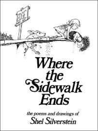
When I went to research this I was floored to learn this book was published in 1974. I always assumed the book was my age, which certainly speaks to the timeless nature of the poems and illustrations of Shel Silverstein.
There are so many illustrations in Silverstein’s book, ranging from cute and humorous to downright frightening. The cover of Where the Sidewalk Ends has always been one of my favorite because in one simple sketch, it manages to sum up the weird combination of fear, humor and excitement of being a child.
The Stranger:

In 1989, designer Helen Yentus designed a series of black and white geometric covers for Albert Camus’ books, which were originally published in the 40s. The entire series is worth looking at, especially if you’re familiar with Camus’ work.
This particular story is about an emotionally detached main character and his confusingly violent lifestyle. This cover does a near perfect job of suggesting the danger and anxiety felt throughout the story, through the use of sharp angles and high contrast. The movement of the shapes feels like an optical illusion, and causes a bit of vertigo for the reader right off the bat.
The Perks of Being a Wallflower:

At first glance, this cover seems like a mistake. Every single element feels out of place and somehow wrong. However, if you’re familiar with the popular coming-of-age novel, you’ll realize the chaos is most likely intentional. The color of the book hurts, the placement of the letters hurts, and frankly being an outcast teenager hurts. The cover is messy and raw. I appreciate how honest it feels.
Charlie and the Chocolate Factory:

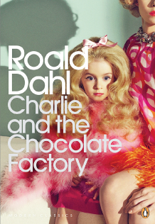
Yes, THIS version. This cover caused quite a stir earlier this year. Just about everyone had an opinion about Penguin’s latest edition of the Roald Dahl’s children’s classic, and many scathing reviews were written on the matter.
I personally loved the ominous, pageant-ready child on the cover, and felt like the critics were getting overly worked up over something trivial. The thing with Charlie and the Chocolate Factory is there is just as much darkness in the story as there is humor. The fact that this cover focuses more on the former is actually quite refreshing.
This is an instance in which a new cover was created, and while it may not be for everyone, it speaks to a different audience who may not have gone for the light-hearted, colorful illustrations of the previous versions. In my opinion, if a cover can do that for a book as old as this, we should absolutely let it.
I don’t want to say we should all start judging books by their covers, but an appreciation for the thoughtful choices that go into the design could potentially open up new ideas and spark interesting conversations.
For more designs we love, check out Creative Packaging for Unique Products.
