The most important element on your homepage is the image right below your logo and navigation bar. You might call it the banner or the header. This image and its accompanying text and call to action will decide whether a new visitor stays and becomes a customer or furiously clicks “Back” to get out.
In contemporary web designs, this area is grows so large it fills the screen on most tablet and desktop computers. It’s kind of a big deal.
How do you design a homepage image area that wows and works? Start with a photograph or graphic that shines with these four facets.
Large and In-charge
Watching a movie on an airplane is 1,000 times less great than watching a movie in IMAX. Pictures are meant to be seen big. Let this homepage area fill up the screen, even down to the fold. A vivid picture as tall as 700px, when paired with a high-quality headline and a compelling call to action might be all the homepage you need.
You might also choose an illustration for this area if a photograph can’t capture your message. Use whatever image you like, just make it big.
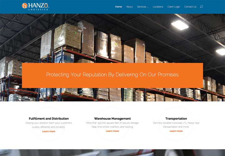
Hanzo Logistics’ website is one of my favorite examples of an image-driven homepage.
One downside of extra-large images is their negative effect on website speed. A large image contains more data and more date takes more time to load. Your web designer should take steps to keep file sizes low and your site load speed under three seconds.
Professional
Customers know your business is reputable by the quality of your homepage images. It’s their first impression of you. It doesn’t matter if your best friend took the picture. If your best friend is an amateur, I wouldn’t put it on your homepage. Customers can tell and they’ll think you’re second-rate.
Poor lighting, focus and composition all betray an amateur. Don’t accept crap pictures.
Ask a marketing consultant to refer you to a local professional photographer. Or purchase stock photos that match your needs. If you’re a cheapskate, consider some of these sources for free, royalty-free images.
Room for Text
The best pages combine a great homepage image with showstopping copy writing. Don’t make your customers think. What you do should be obvious in just one picture and one sentence. Write a sentence that explains the singular benefit all customers experience when working with you. Write a sentence that embodies your marketing position statement.
Mint is an online budgeting and money management tool with oodles of features and products built-in. But their homepage just says, “It’s easy to understand what’s going on with your money.” With Mint, that is. They convert visitors to customers by combining a strong image with winning text and an obvious sign-up button.
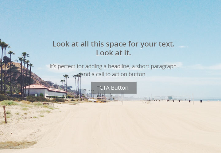
To fit these words in, your image needs to have a little extra room built in. It needs some blue sky, some open water and some kind of copy space to place the words in.

Stands Alone
I hope you already know that sliders are terrible. A fantastic homepage image can stand on its own without the support of three other slides. Put your imagination (and budget) to work on just one. Don’t dilute your efforts and visitors’ attention with animations, transitions and multiple messages.
What’s better? A homepage crammed with distractions? Or a homepage that absolutely slays with a clear message and singular focus?
You might wonder if you need an image at all. Sometimes, words are enough. The minimal web design movement of the past year brought a raft of text-only, typography driven sites. Most of them are experiments or personal websites, but they show off the increased availability of custom fonts and some very imaginative layout ideas.
The purpose of a homepage is to tell your customers who you are and what you do. The homepage image is the first impression, the front door and the invitation to step inside. Make it good.

