Usually when I write blog posts about logo designs I enjoy, they’re big, nationally recognized brands. These are brands everyone knows and loves, but I wanted to take some time to recognize some of the great designs I’ve seen right here in Indiana.
If you’ve ever attended Penrod, (and I highly suggest you do) you know it’s referred to as Indiana’s nicest day. I’ve been several times, and it’s lived up to its name each time. The annual art fair is full of so much creativity and whimsy, it’s hard not to feel inspired.

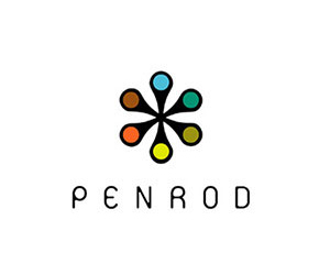
The logo itself is simple, but at the same time, it has some very unique features, especially in the typeface. Often when I’m looking at typefaces for a project, I’ll come across one which is really unusual and has a lot of personality. It won’t be right for the project I’m working on, but I’ll make a note to come back to it when I have the right project. The Penrod font feels this way to me. It wouldn’t be appropriate for most projects, but with it’s surprising shapes and curves, it feels perfect for such a fun, inspired event.
The icon which accompanies the name is usually shown with six brightly colored circles, but it also looks really striking in all black. The multi-color version really stands out on signage around the festival, but the fact that it can be done in virtually any color or combination of colors makes it really versatile, which is important for an event that needs to freshen up its advertising materials annually.
Visit the Broad Ripple Farmer’s Market any Saturday during from May to November, and you will likely take notice of the Silverthorn Farm booth. This farm definitely understands the importance of good branding and marketing. Their booth is always set up impeccably, with produce displayed in an appealing way, and a large banner at the back of the booth with their eye-catching logo.
The logo looks like it was stamped on, and has a sort of handmade look to it, which is perfect for a farm with a very hands-on approach.

The script font adds a bit of classiness to the logo, which I think is a good reflection of how the business is done. Silverthorn is a great example of how to market what isn’t typically thought of as a glamorous profession.

This is probably my favorite logo in all of Indianapolis, and also one of my favorite places to eat. Taste was started by Deidre Henry, and Marc Urwand, two chefs with impressive histories that span from NYC to LA. The style of dining at Taste is pretty unique, in that guests go through a cafeteria-like line, and then food is delivered to them, often at one of the big communal tables located in the center of the restaurant.
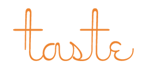
The logo is just as interesting as the dining experience, thanks to the custom lettering. The ‘Ts’ in the design really stand out as one-of-kind, and make this almost seem like a work of art. The balance of positive and negative space appears to be really well thought out, and goes nicely with the decor of the restaurant. The color choice makes perfect sense as well, especially for a restaurant that wants you to dine with them as much for the experience as the amazing food.
These are just a few Indiana companies who have interesting brands, but there are many others as well. Next time you’re out and about, or even if you’re just visiting, take note of all the great local businesses who are doing their part to help bring attention to the wonderful state we live in.
