Usually I consider myself pretty good at talking with clients and finding a happy medium between what they say they want, and what they actually need. But every now and then I find myself at a standstill on a project. This was one of those projects.
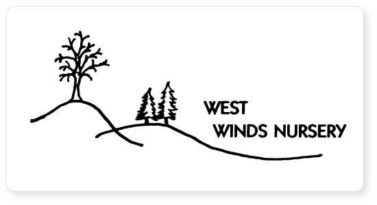
West Winds Nursery was ready for a much-needed redesign of their hand drawn logo. In general they liked the layout of their logo, the tree imagery and hand-drawn look. They were hoping we could transform this into a more polished logo for their firm.
 I sent the client two rounds of logo designs I had created in Illustrator which included various styles of trees and hills similar to their old logo. Some were literal and others were more stylized, but for the most part the images were done in my “style,” which is very clean and simple.
The feedback I received from the clients was a little discouraging. While they thought my concepts were attractive, they didn’t feel I had met all the criteria because the logos didn’t have the sketched or hand-drawn feel they were hoping for.
At that point, I decided to have another conversation with them about what they hoped to achieve with the logo. They expressed how much they liked the style in which their old logo was done, but wanted something that was more professional. We both agreed the new logo should be much cleaner, have a good ratio of text to graphic elements, and also be “unique.”
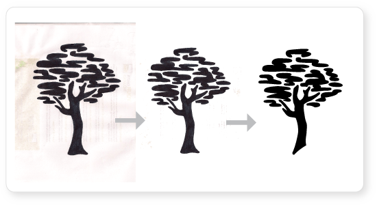
I opened Illustrator to start working on the next round, and then decided it was time to take a different approach. So I got out a scrap of paper and a Sharpie and started drawing trees. I almost always sketch out ideas before I start a new design, but drawing logos by hand and scanning them into the computer is something I haven’t done since college. After I settled on a tree I liked and cleaned it up in Illustrator I sent it off to West Winds and hoped for the best.
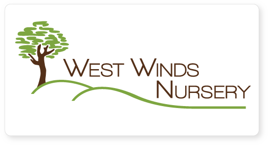
To my relief they really liked it and felt it was a good representation of their brand. We were both happy with the outcome and felt the unique hand drawn tree was a more polished and professional version of the original, without sacrificing the charm of the hand drawn logo.
What I learned from this experience is that no matter how much technology evolves and changes, sometimes to achieve the best results you just have to get out a pen and some paper and do it the old-fashioned way!


