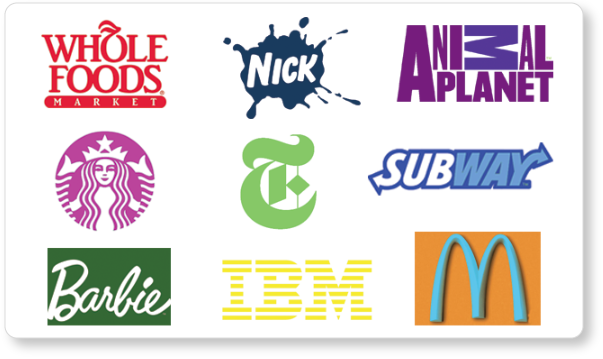
A few weeks ago we had a bit of fun with some popular logos. We switched the fonts to see how it would impact the way we felt about a brand. The results were pretty interesting, and in some cases, very funny. I was surprised by just how wrong the companies logo design looked without their signature fonts. It definitely showed just how much font choice affects the way a brand is perceived.
The typeface you choose to represent your brand isn’t the only important thing to consider. Just as much, if not more time should be spent choosing the right color palette. If you think about it, colors are one of the first things we learn as a child, and we use them to make decisions for the rest of our life.
Color theory, while not an exact science, is a good practical method to determine how certain colors and color combinations will be perceived by the viewer. For instance, we are trained to associate the color red with danger or excitement, but when it is paired with yellow we tend to associate it with hunger, which makes it the perfect combination for a fast food logo.
Here are some colors, and the words that are most commonly associated with them:
- RED- Danger, aggression, excitement, energy, speed, passion
- ORANGE- Fun, enthusiasm, youth, creativity
- YELLOW- Happiness, energy, speed, hunger, warmth, caution
- GREEN- Life, nature, freshness, money, healing, tranquility
- BLUE- Business, trust, authority, power, confidence, wisdom
- PURPLE- Wealth, royalty, power, mystery, luxury
- PINK- Femininity, romance, calm, beauty, compassion
 While there are always exceptions to this theory, designers should always consider the things a color is most commonly associated with. For instance, if the Whole Foods logo had been done in red, which represents danger and aggression, consumers would have had a more difficult time associating that logo with fresh and healthy foods.
The Starbucks and Animal Planet logos also use the color green to their advantage. The Starbucks mermaid logo just doesn’t say “fresh, natural coffee” when switched to pink, which is usually better suited for beauty products and things related to romance. Similarly, the Animal Planet logo seems to be sending conflicting messages when its vivid green is replaced with a royal purple.
The logos for Nickelodeon and Barbie are both very bright, fun and well-suited for children. Putting them in dark shades of blue and green makes them feel too serious. On the other hand, The New York Times and IBM are very adult, information based companies and dark, cool colors suit them much better than bright colors such as lime green and yellow.
When it comes to fast food, yellow is one of the most common colors, especially when combined with red. McDonald’s is probably the most well known example, but Burger King, Hardees, Wendy’s and Dairy Queen all use this combination as well. Something about the color yellow seems to ignite hunger in people, and also symbolizes speed, which makes it no surprise it is so commonly used in fast food restaurants.
Choosing the right color or combination of colors to represent your brand is imperative, since it’s typically the first thing the consumer registers and hopefully remembers about you. Color theory is by no means a law that must be followed in a logo design project, but is definitely an important thing to learn and understand if you want to send the right message about your brand.
