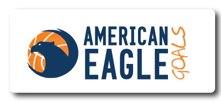
When you hear the name American Eagle Basketball Goals you probably envision something in red, white and blue with a heavy Serif font to give it a traditional feel. But this product is anything but traditional and so one of Jenna’s challenges was to give them a logo which would make them stand out as well. Her other challenge was to give them something which would look equally good on top of a web page or on the product itself.
The design process started as she searched for images of an eagle. The one she selected is strong, but not a literal image of an eagle with arms outstretched that seem to wrap around the image of the ball. While she did retain a fairly traditional blue, there was no place for red in this design. Instead she selected a shade of orange which is similar to the actual color of a basketball. The clear contrast of the colors is striking on their website and in print.
The font choices are also somewhat unexpected. Instead of a very heavy serif font, Jenna selected Go Long for the words American Eagle. The very straight line looks like the lines of a basketball goal. The word Goals is turned on it’s side to frame the logo. And the choice of Christopher Hand font gives a fun, playful feel to the design.
The website is complete and the logo looks great on the page. We can’t wait to see how this logo will look on their new goals.

This logo was designed by the team at Roundpeg, an Indianapolis graphic design firm.
