One of my favorite things to do as a designer is to take existing material and give it a new (and of course, improved) look. Don’t get me wrong, I love the excitement of starting from scratch, but there is something very rewarding about watching a design reach its full potential.
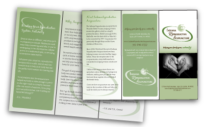
I recently did a redesign of two brochures for Indiana Reproductive Acupuncture. Their original design lacked personality with few graphics and a very text heavy design. Because the brochures were designed for expectant mothers and women trying to become pregnant I wanted to make sure the brochures had a warm and inviting feel to them. I loved the colors in the logo sent to us by the company, so I only made a few minor adjustments. Originally there was a large dark green oval around the company name and swirl. After some discussion we decided to remove the oval so the logo could “breathe” a little. I feel the open space around the logo helps it feel more natural and brings more attention to the swirl, which is meant to represent movement and the life cycle.
For the cover, I chose black and white photos not only because of their strong visual impact, but also because I wanted them to seem like portraits, so the women could imagine all the memories they would be creating with their future families.
For the inside of the brochure, I knew a soft gradient with a faded version of the swirl from the logo would give an overall soft and gentle appearance. The original brochure contained so much text, it felt very cluttered and unorganized. Allison was able to work with the client to decide which parts of the copy were most important to the patients. This allowed us to organize the different sections and give them each their own distinct area. The quotes from actual Indiana Reproductive Acupuncture patients were very important, so I wanted them to stand out from the rest of the text. This was achieved not only by setting the text in green and making it larger, but also by placing a version of the swirl next to each quote. This created continuity throughout the design, and also helped draw the eye to these areas.
In the end the brochures ended up delivering just the right amount of information, in a reassuring way, which is exactly what Indiana Reproductive Acupuncture was looking for. The changes made during this redesign ended up greatly improving the brochures both functionally and aesthetically.
