Branding is more than just a pretty colors, cool fonts or an attractive logo. True branding begins long before you put pen to paper, with an analysis of your clients. – Who are they, what do they need, and then what do you do for them, and what do you want them to think about you?
Once you answer these questions, you are ready to start designing your logo. If your target customers, are upscale, women who own GUCCI and YURMAN, be sure to look carefully at those brands. You don’t have to copy their style, but as you design your brand, create your look and feel so it is consistent with how your client defines “quality and style”
If your customer, is a 22 year only male, look at sports products, social networks, and university literature for clues on color and style. You don’t have to be cookie cutter, just familiar.
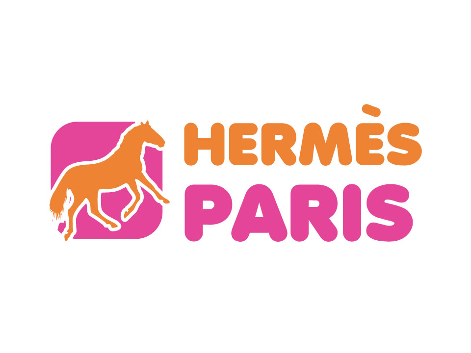
What happens when you get off track? You end up with a logo that somehow feels out of place. For example, what would happen if the graphic designer for Hermes took inspiration from the branding colors of Dunkin Donuts. You would end up with something that looked like this

It is cute, colorful and fun, but nothing about this says expensive quality. For more examples of what happens when you get the customer wrong check out a few of our brand swaps. These funny exercises help us see just how important great design is.
